
Matre: Brand Identity
Feb 2025
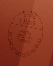
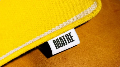
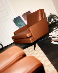
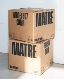
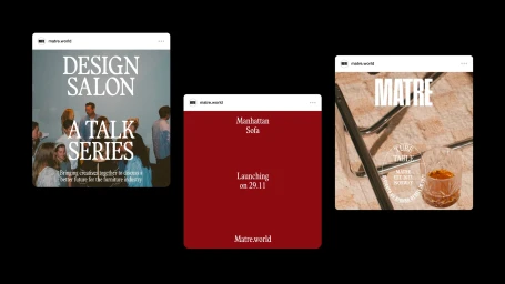
Matre’s brand identity project establishes a visual language rooted in Norwegian furniture design history. Developed through a collaboration between Bielke&Yang and Rolodex Studio, the project spans digital platforms, custom packaging, and motion assets that highlight pieces by designers such as Sigurd Resell and Fredrik Kayser. The visual system leans into a tactile, clean aesthetic, utilizing macro product photography and warm, natural light to emphasize the grain of leather and the structure of woven textiles. Emboss & deboss techniques feature prominently on physical collateral, reinforcing a focus on craftsmanship. Motion graphics and editorial typography integrate archival imagery with product documentation, communicating a refined brand presence. Production contributors include Stephanie Sikkes, credited for photography, and JUBAFiLM AS, who provided film production services.
Horizontal, Commercial, Clean
Brand Film / Corporate Video


