Martha's Gardens: Brand Identity


Apr 2022
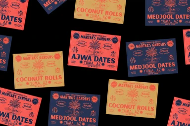
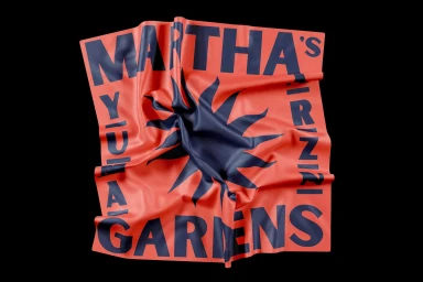
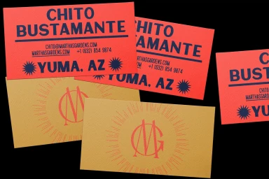
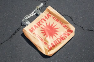
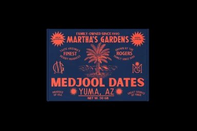
In the competitive landscape of CPG and packaged food, Martha's Gardens has emerged with a bold new brand identity that masterfully blends retro-inspired charm with modern, high-contrast graphic design. By leaning into a vibrant palette of coral, sunny yellow, and deep navy blue, the visual language establishes a distinct shelf presence that pays homage to the brand's roots in Yuma, Arizona. The project excels through a cohesive application of typography and vector illustration, utilizing stylized sunburst motifs and palm tree iconography to evoke a warm, desert-inspired heritage. This commercial identity is elevated by the tactile quality of textured matte cardstock and crisp product packaging, creating a professional and inviting aesthetic that resonates across various touchpoints. The collaboration between graphic designer Jesús López and illustrator Rafael Fong is evident in the project's meticulous symmetry and balanced layout, ensuring every piece of collateral—from date spread jars and business cards to cotton tote bags—feels part of a unified, thoughtful system. Through the strategic use of soft light and professional flat lay composition, the work avoids excessive clutter, instead embracing a clean, minimal approach that allows the product information to shine. This identity reads as both authentic and premium, effectively positioning Martha's Gardens as a thoughtful player within the specialty food and beverage market.
Horizontal, Commercial, Clean
Typography
Black Seamless
Advertising Campaign