
MAPP MTL: Brand Identity
Mar 2020
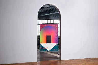
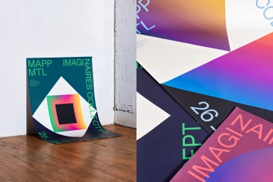
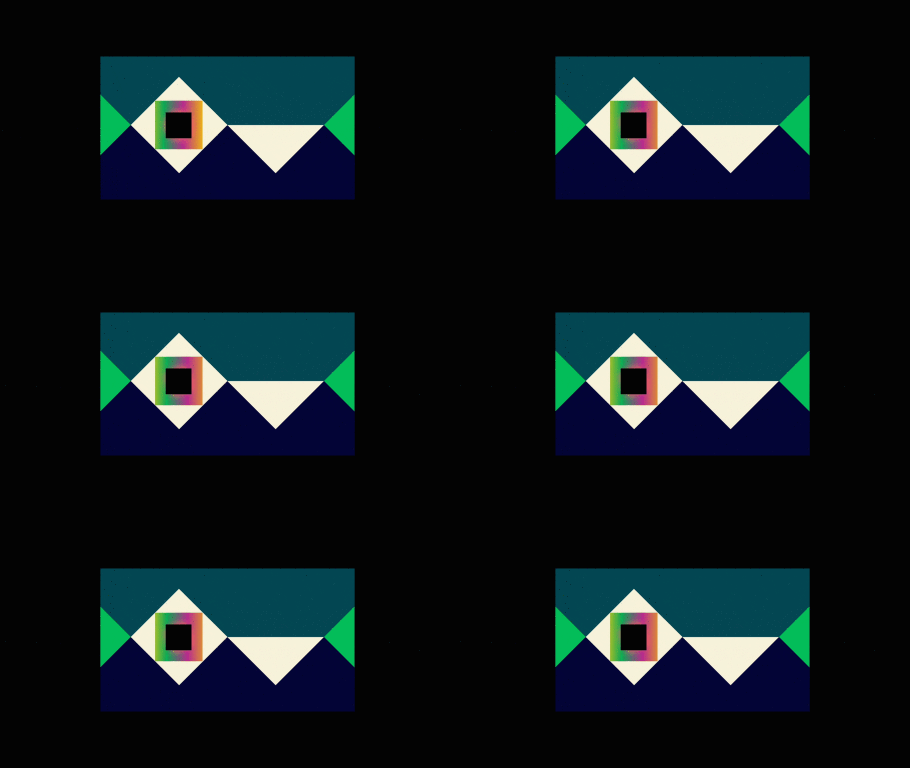
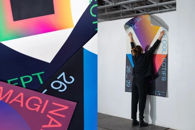
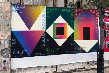
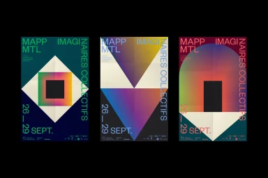
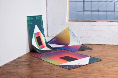
The brand identity developed for MAPP MTL serves as a masterclass in modern, graphic communication within the competitive landscape of Festivals & Events. By leaning into a high-contrast aesthetic that bridges the digital and physical worlds, the creative team at Demande Spéciale has established a visual language that feels both immediate and timeless. The project utilizes a bold, geometric framework anchored by crisp sans-serif typography, which cuts through the noise of urban environments with intentionality and precision. Central to the system are vibrant, multi-tonal gradients that transition seamlessly from hot pinks to deep cyans, creating a luminous, digital-inspired energy that contrasts sharply against dark, moody backgrounds. The execution relies heavily on vector precision and intentional minimalist typography to maintain a structured, yet fluid hierarchy across a variety of touchpoints, from wheat-pasted street signage to interior exhibition posters. By integrating live-action techniques, the project captures the tactile nature of environmental branding, grounding its surreal color palettes within raw, industrial settings. This holistic approach to graphic design ensures the festival remains visually distinct while honoring its identity as a hub for collective imagination. The result is a highly structured yet dynamic brand system that feels right at home on a weathered concrete wall or within a clean, gallery-like space, proving that thoughtful artistry remains the most effective form of communication.
Horizontal, Commercial, Clean, Graphic
Typography
Advertising Campaign
