
Enclume
Brand Identity
Sep 2019
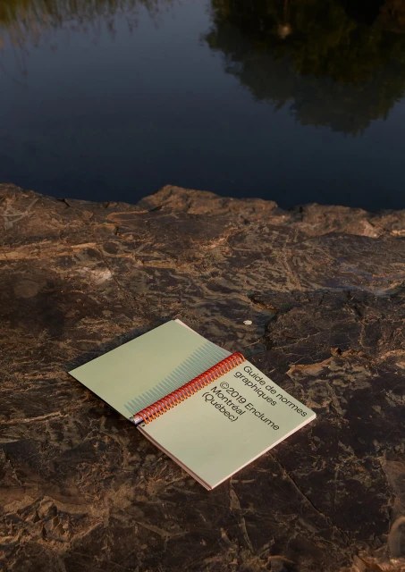
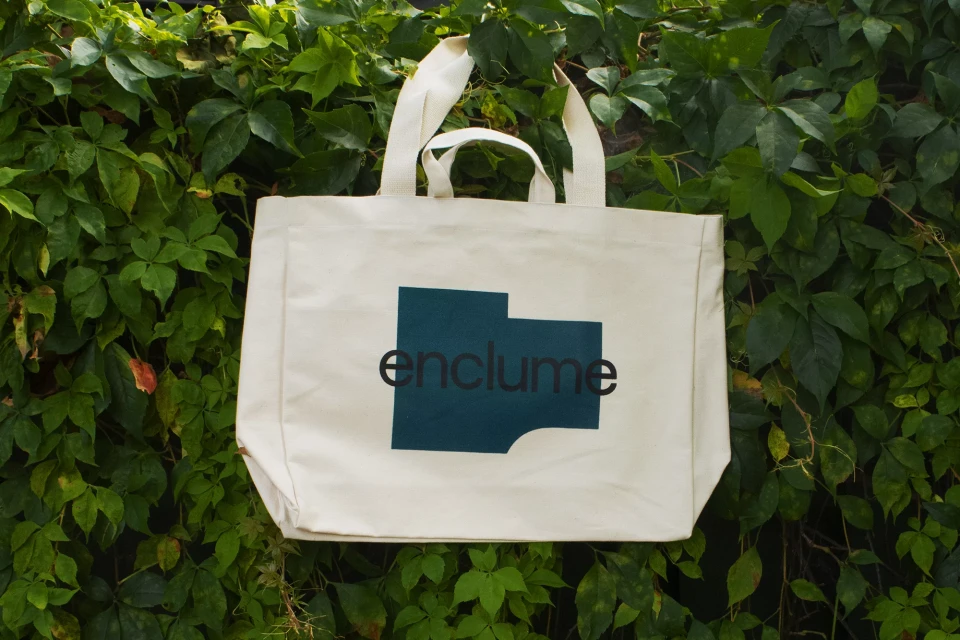
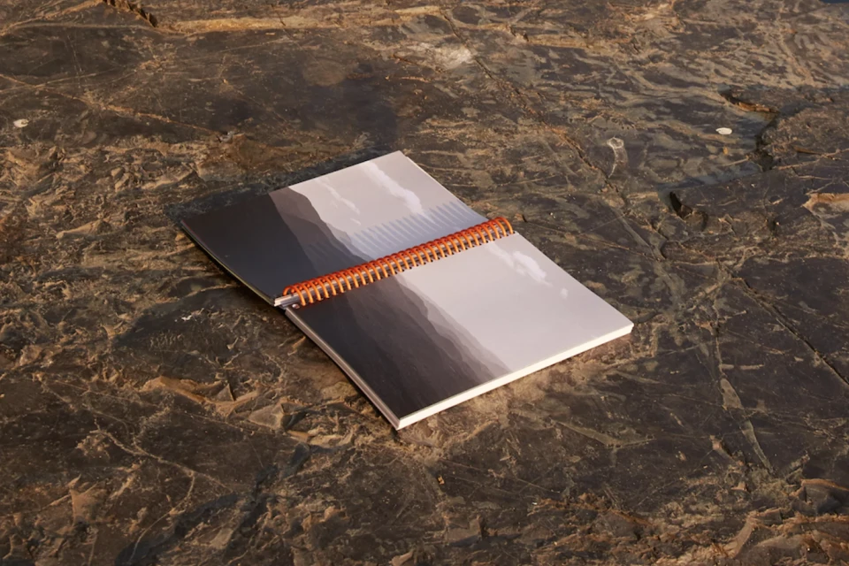
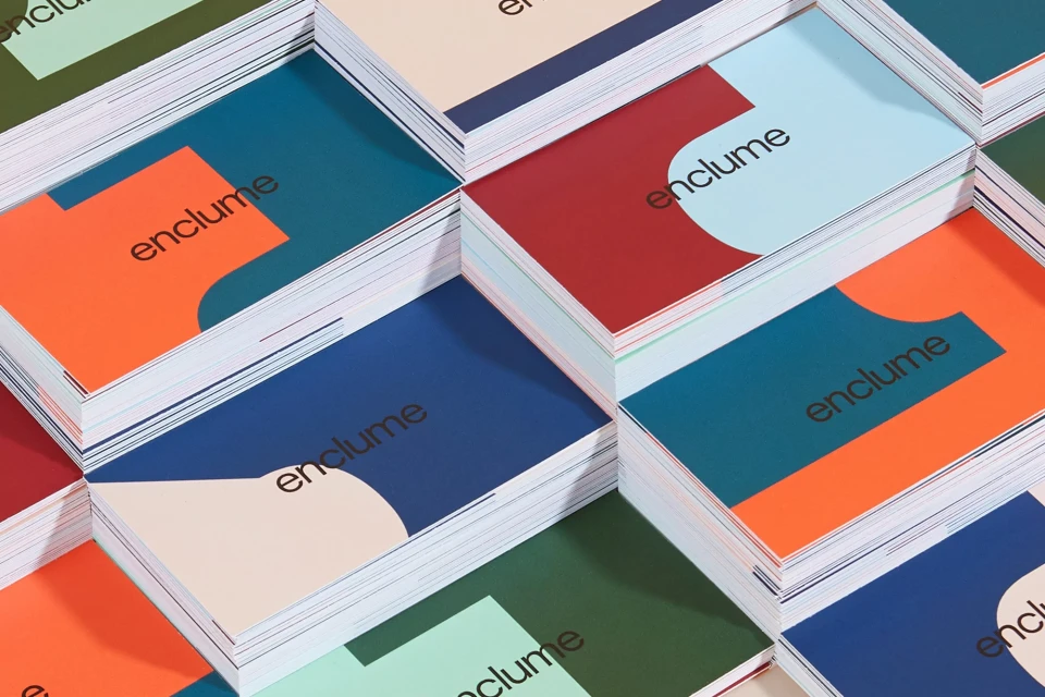
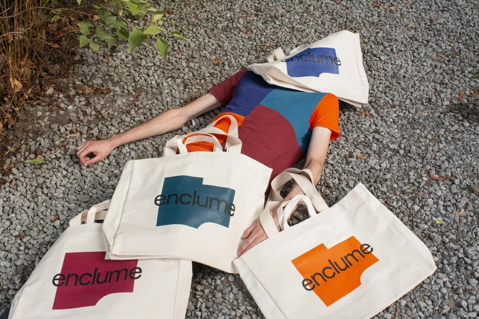
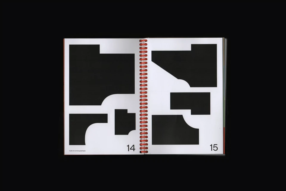
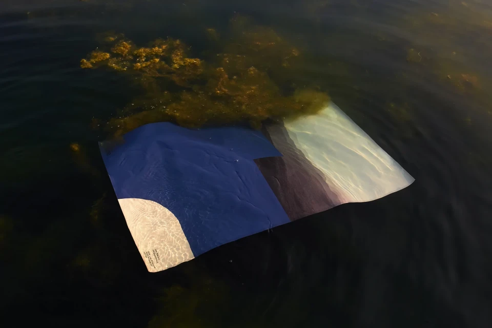
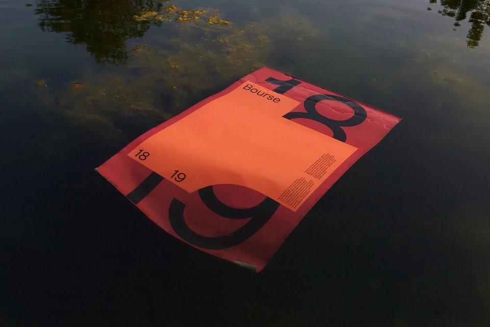
The brand identity for Enclume manifests as a masterclass in contrasting elements, balancing the precision of corporate design with the unpredictability of the natural world. Developed through the visionary lens of the design studio Demande Spéciale, the project transcends traditional collateral by positioning the brand within a tactile, immersive environment. The visual language relies heavily on a sophisticated palette of deep navy, vibrant orange, and soft cream, utilizing clean sans-serif typography that feels both modern and authoritative. Across a suite of assets—from minimalist stationery and structured canvas totes to complex graphic manuals—the identity leans into an editorial aesthetic that celebrates the beauty of raw materials. The photography serves as a critical narrative device, capturing branded elements against rough stone, dark water, and dense foliage. By utilizing natural light and intentional, high-contrast compositions, the project creates a surreal interplay between the synthetic rigidity of printed matter and the organic fluidity of its surroundings. Whether showcasing the crisp edges of business cards or the conceptual layering of branded textiles in a gravel-strewn lifestyle shot, this project demonstrates an exceptional commitment to print quality and artistic execution. It is a cohesive, highly disciplined display of visual identity that feels less like a corporate manual and more like a curated, artistic statement rooted in intentional craftsmanship.
Clean, Horizontal
Advertising Campaign
