
Frank And Oak: Brand Identity
Nov 2021
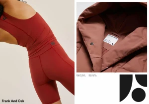
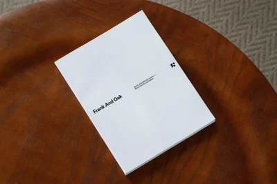
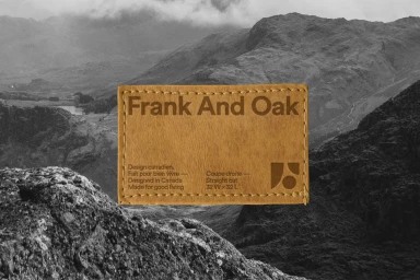
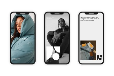
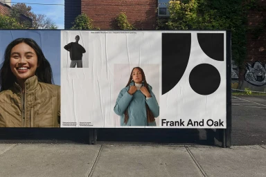
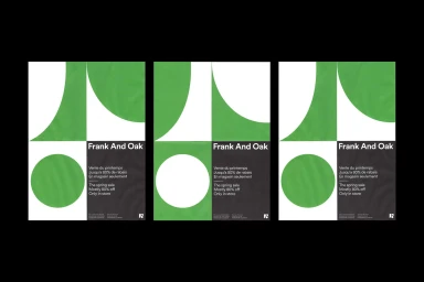
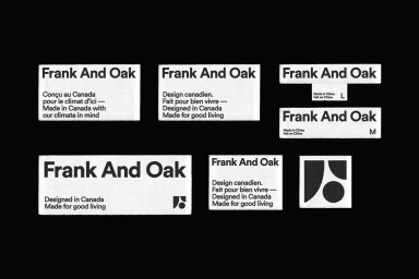
Frank And Oak’s comprehensive brand identity project establishes a visual language across print, digital, and out-of-home platforms. The work integrates lifestyle apparel photography with clean, minimalist typography and geometric icons, reflecting the brand’s focus on structured design and climate awareness. Demande Spéciale led the graphic design, employing high-contrast monochrome palettes and earthy textures to ground the visual system. From digital UI mockups and promotional posters to physical fabric labels and brand guidelines, the identity maintains a polished aesthetic. The project utilizes natural light in its documentation, emphasizing raw, commercial applications of the brand system in urban environments.
Horizontal, Commercial, Clean, Minimalist
Typography
Advertising Campaign
