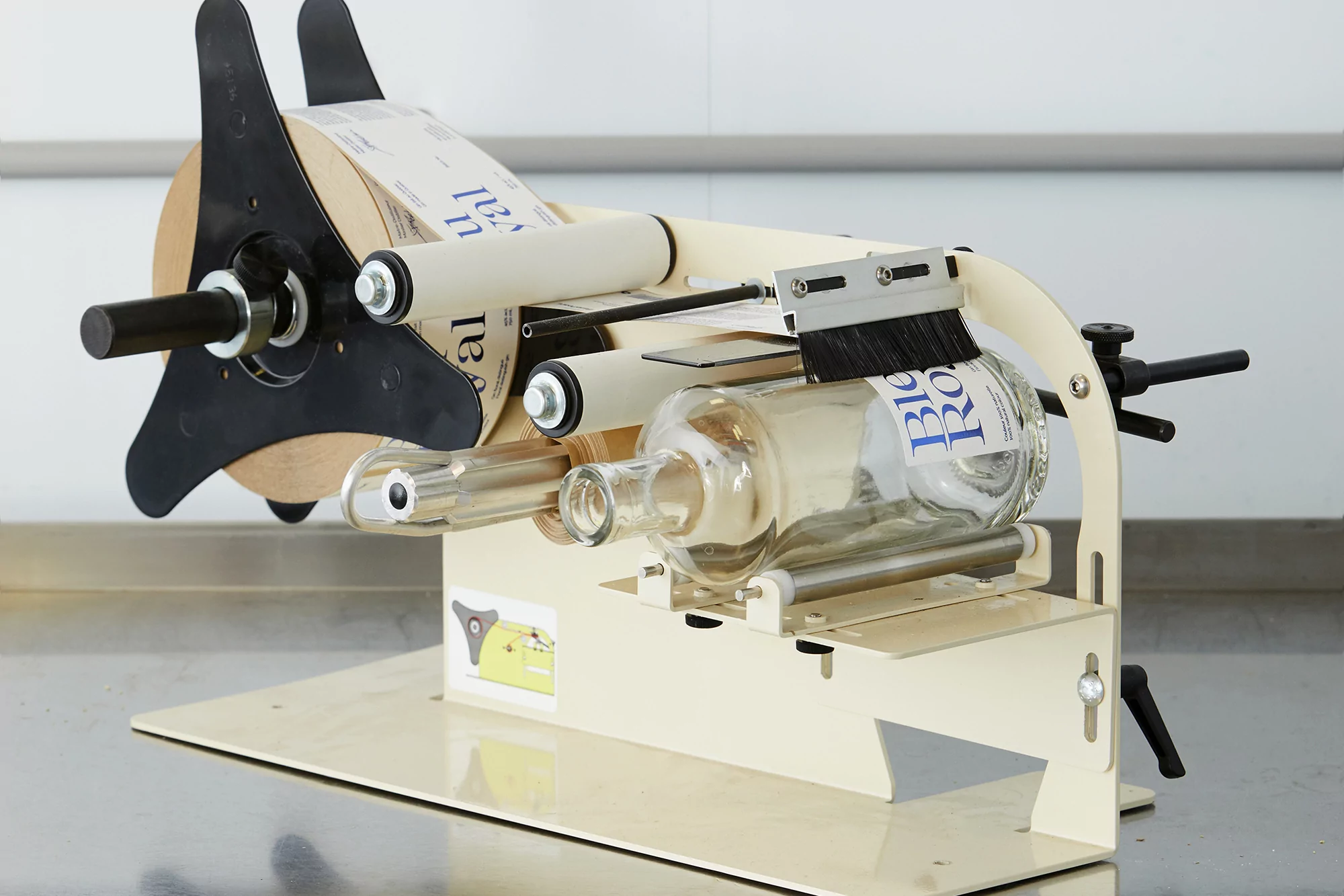
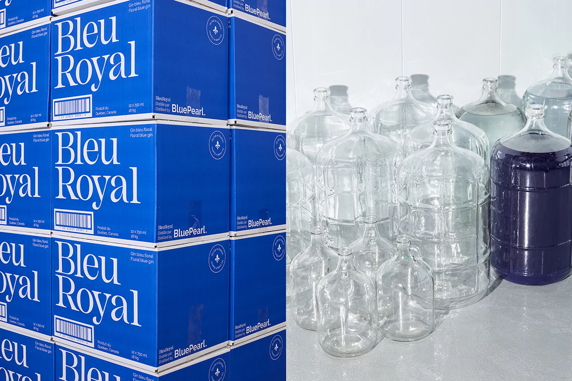
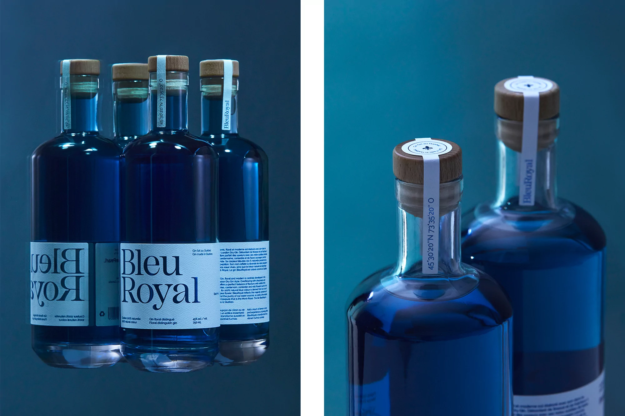
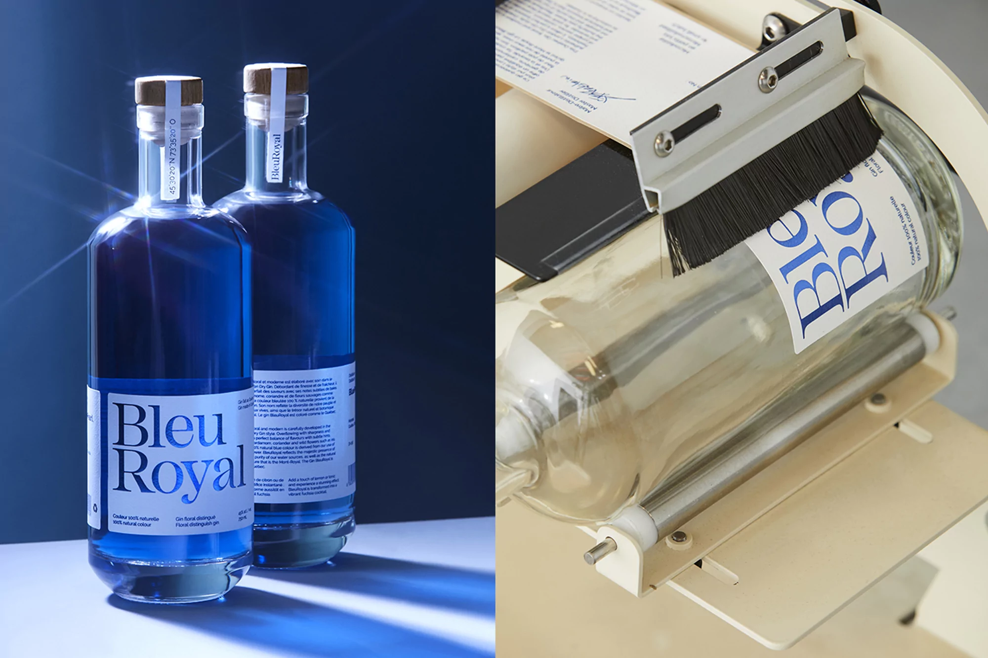
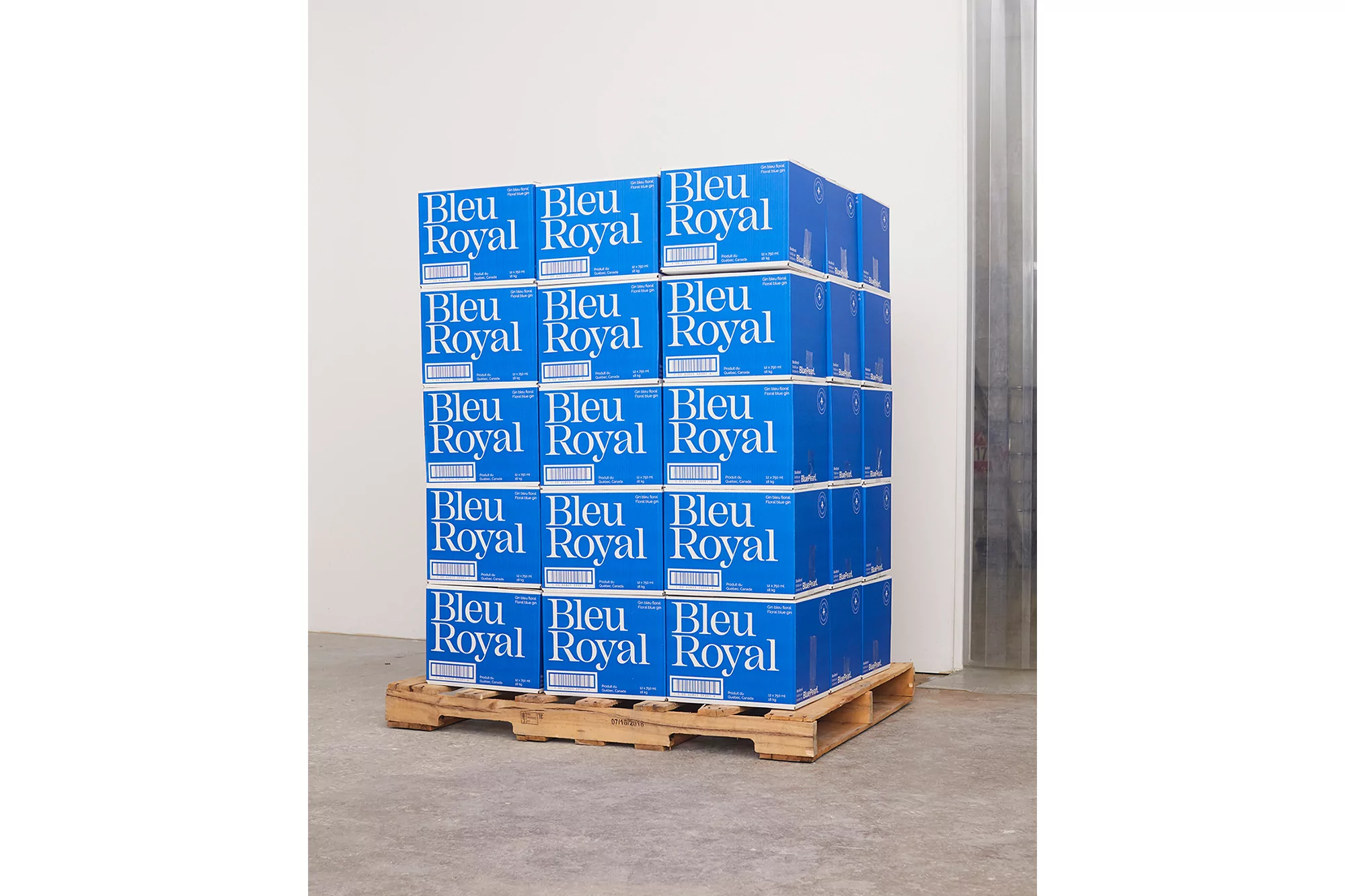
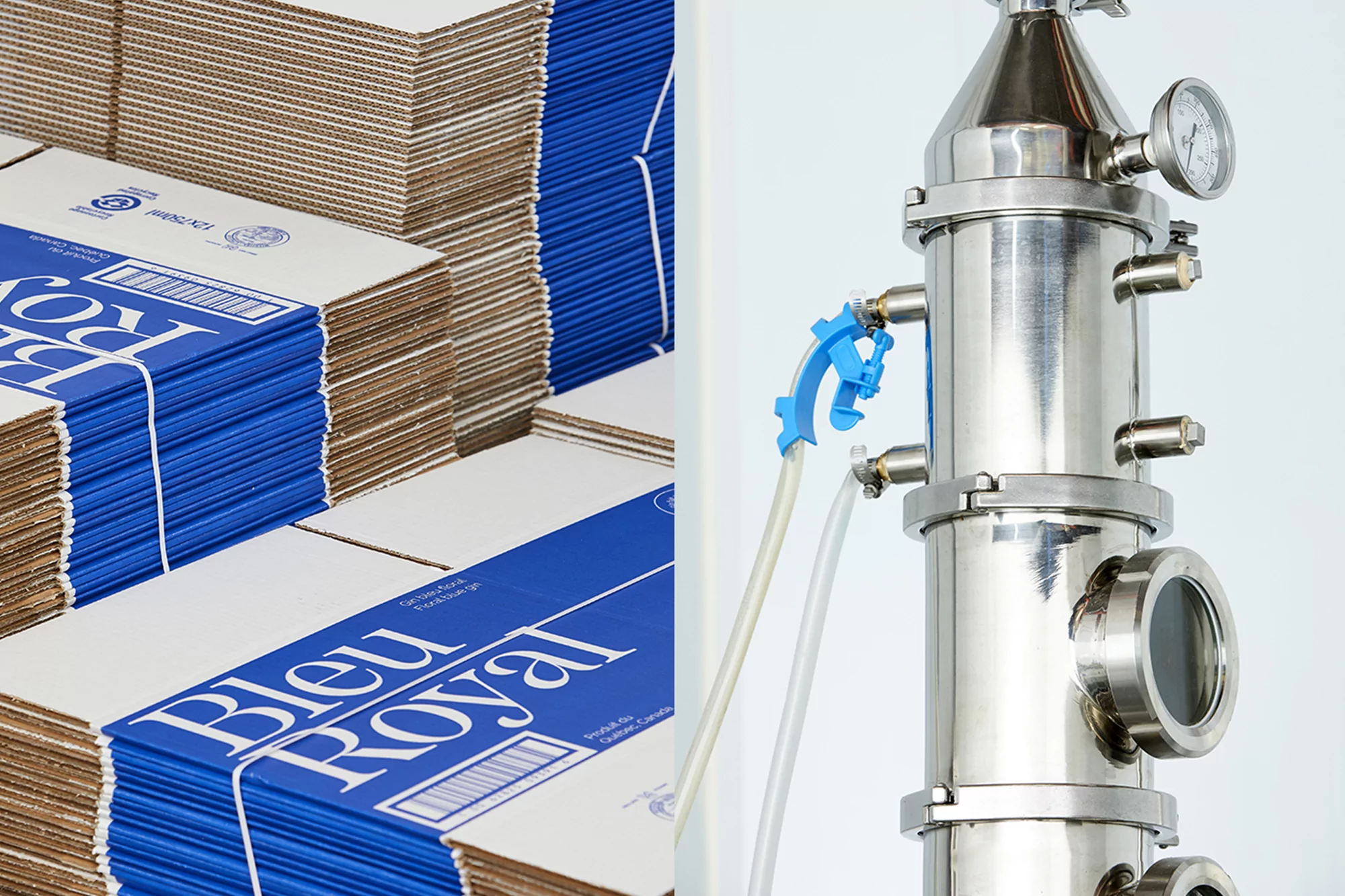
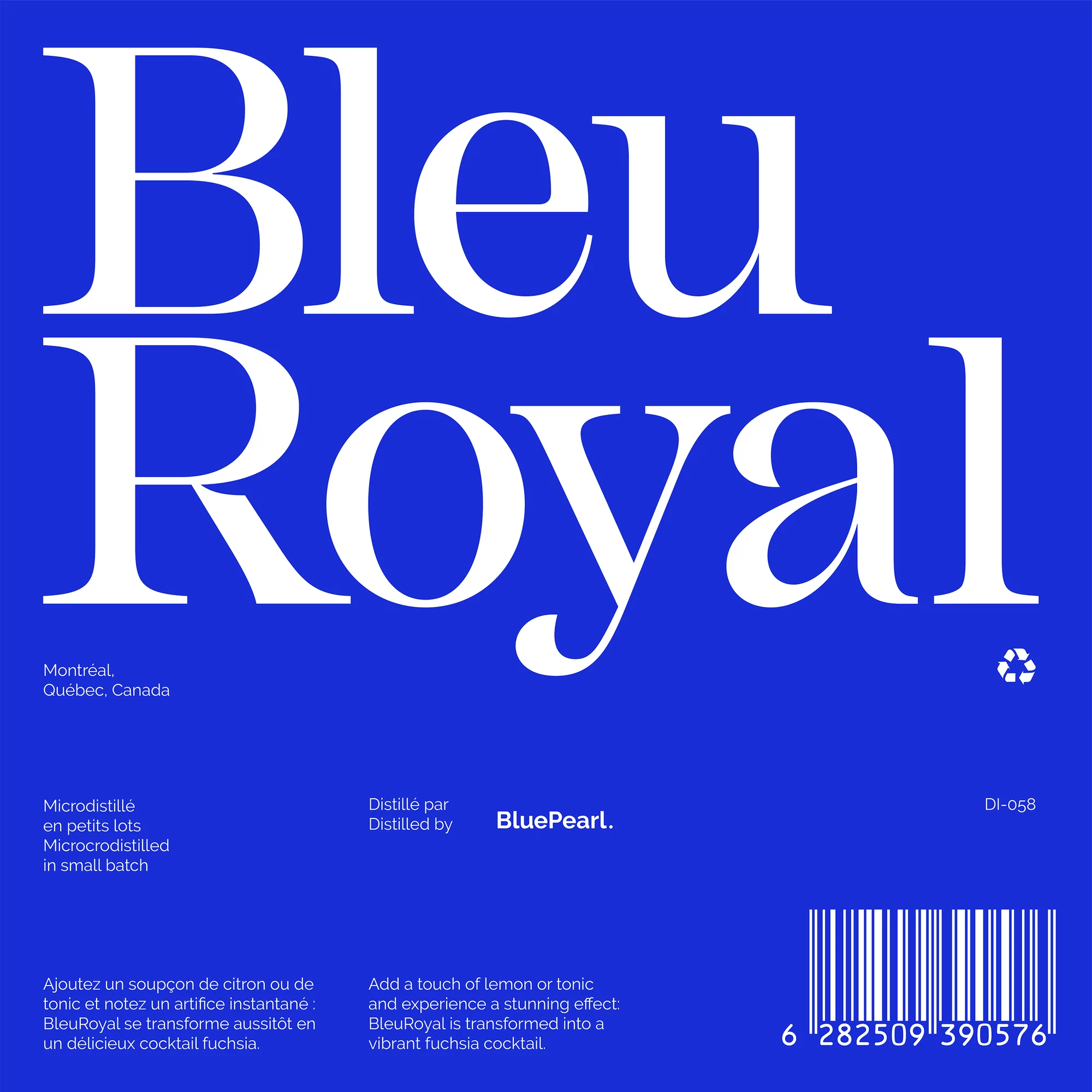
The brand identity for BleuRoyal, a premium entry into the alcoholic beverages industry, is built upon a foundation of minimalist precision and industrial elegance. Developed with creative expertise from Demande Spéciale, the visual language of the brand pivots between the raw technicality of a Montreal-based micro-distillery and the polished, cinematic allure of the finished product. The project captures the essence of the gin through a series of commercial photography and graphic design assets that lean into a clean, modern aesthetic. By juxtaposing the tactile realities of production—such as manual bottle labeling machinery and intricate stainless steel distillation columns—with the refined beauty of the final bottled liquid, the identity creates a cohesive narrative of quality and craftsmanship. The use of beauty light and natural light techniques highlights the vibrant, deep blue tones of the gin, while the typography employs a sharp contrast between bold serifs and modern sans-serifs to establish a sophisticated, high-end presence. Every element, from the deliberate geometric composition of product packaging to the refined off-white paper labels, feels considered and purposeful. This project serves as a masterclass in visual storytelling, where live-action technique and editorial sensibilities converge to define a brand that feels both meticulously engineered and deeply artisanal within the competitive landscape of spirits.