
Manataco: Brand Identity





Oct 2019
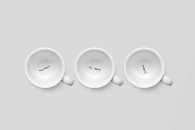
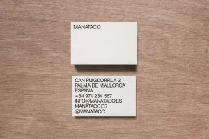
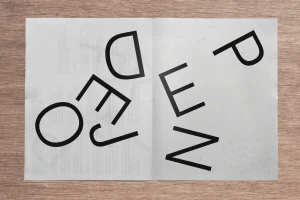
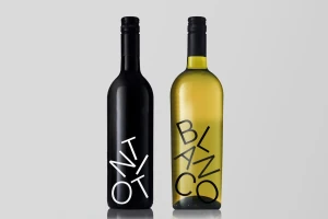
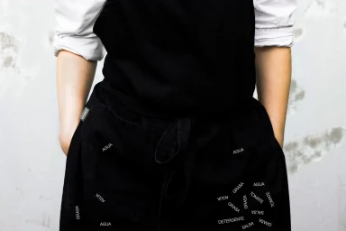
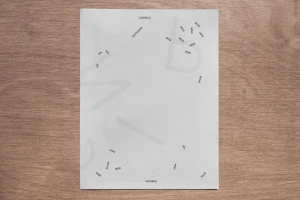
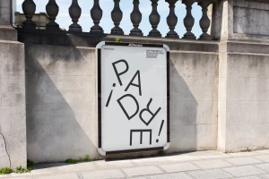
The brand identity for Manataco serves as a masterclass in editorial minimalism and functional graphic design. By leaning into a high-contrast aesthetic, the project establishes a cohesive visual language that effortlessly bridges the gap between corporate professional identity and artistic expression. The work, executed with the sharp precision of Pentagram, focuses on the power of typography as a primary narrative tool. Through the strategic use of sans-serif lettering and unconventional layouts, the identity transforms mundane elements into dynamic patterns. This is evident across a diverse array of touchpoints, from the geometric chaos of custom apparel and waffle-weave textiles to the deliberate, macro-focused photography of branded tableware and stationery. The design system utilizes a palette of stark black and white, complemented by light-toned wood and textured architectural surfaces, creating a sense of urban sophistication that anchors the brand in its Palma de Mallorca roots. Whether applied to high-angle outdoor advertising, minimalist packaging, or functional tote bags, the typography remains the constant, binding each asset together through repeated, playful wordplay. The result is a highly tactile, modern brand presence that feels both experimental and refined, proving that clarity of vision and bold graphic choices can transform even the most utilitarian materials into a compelling and memorable corporate identity.
Horizontal, Commercial, Clean, Minimalist
Advertising Campaign
