
Little Sister: Brand Identity






Aug 2023
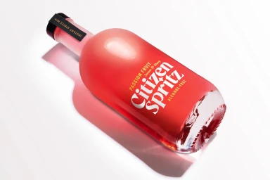
The brand identity for Little Sister serves as a masterclass in modern commercial design, where minimalist graphic elements meet a playful, systematic visual language. Through a series of carefully curated touchpoints, the identity leans into a vibrant color palette of lavender and red, anchored by bold, distinctive typography that feels both modern and approachable. The project demonstrates an acute awareness of composition, utilizing natural light and high-key, clean aesthetics to elevate functional items like disposable paper cups and product packaging into cohesive brand assets. Whether through a rigid, high-angle grid of patterned cups or the deliberate, stark presentation of a custom logo, the work consistently prioritizes clarity and visual hierarchy. Beyond mere logo application, the identity project extends its reach into wider environmental contexts, such as wheat-pasted urban posters and outdoor billboard signage, which bridge the gap between polished corporate branding and the raw, textured grit of the street. By balancing a strictly structured grid with whimsical, wavy design motifs, the brand strikes a clever balance between professional rigor and creative spontaneity. Executed with technical precision, the work functions as a complete visual ecosystem, ensuring that every interaction—from a sandy, beach-themed product shot to a sleek packshot—reinforces a singular, recognizable character that resonates across multiple commercial mediums.
Horizontal, Commercial, Clean


