
Rugiet: Brand Identity
Jun 2026
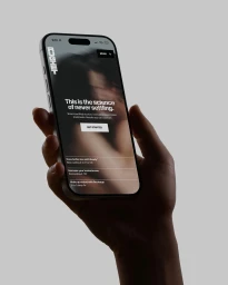
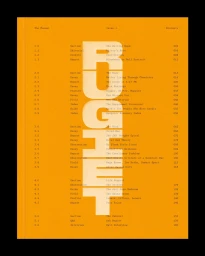
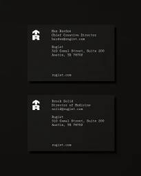
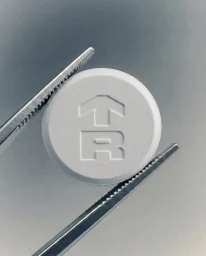
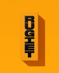
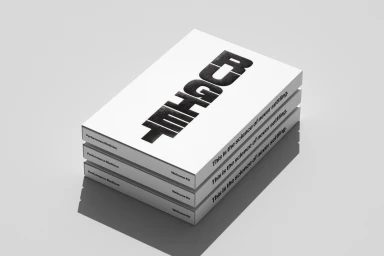
The brand identity for Rugiet marks a sophisticated pivot into the performance medicine space, utilizing a design language that is as clinical as it is contemporary. Orchestrated by the creative teams at Pentagram and Alright Studio, the identity moves away from traditional medical aesthetics in favor of high-contrast minimalism and bold, punchy color blocking. By leaning into vibrant orange tones paired against stark, matte black and neutral grey backdrops, the project establishes a commanding visual presence that resonates with a modern audience. The execution relies heavily on the power of typography, where large, blocky sans-serif letterforms anchor the brand across both digital UI illustrations and tactile, physical collateral. Through precise studio strobe lighting and macro photography, the team captures a clinical elegance that frames their product, such as the debossed tablets and minimalist packaging, with meticulous clarity. The overarching creative strategy successfully balances the technical nature of performance science with an approachable, design-forward sensibility. This is most evident in their cohesive print materials and mobile interface, where the slogan, This is the science of never settling, serves as a recurring visual motif. Ultimately, the collaboration delivers a rigorous, high-end identity that feels both established and disruptive, positioning Rugiet as a premium leader in its category through an unwavering commitment to refined graphic design and clean, architectural structural forms.
Vertical, Commercial, Minimalist, Clean

