
MAD: Brand Identity


Feb 2020
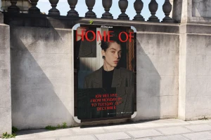
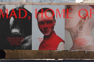
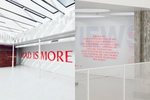
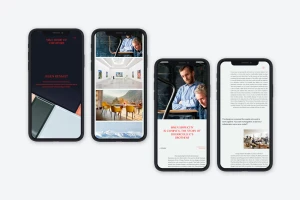
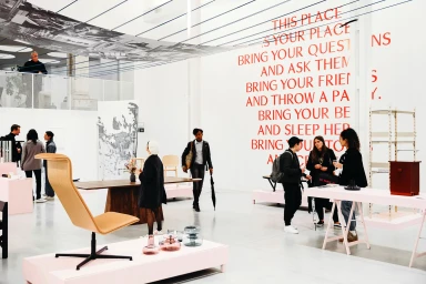
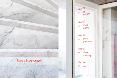
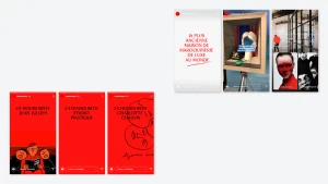
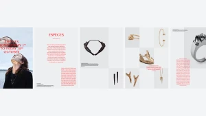
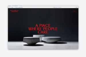
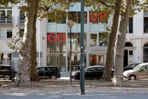
The MAD brand identity project is a masterclass in editorial minimalism, seamlessly weaving together high-contrast aesthetics with a deeply collaborative spirit. Centered around the concept of a home for creators, the branding establishes a sophisticated, multi-faceted identity that transitions effortlessly between physical exhibition spaces and digital interfaces. Stoëmp Studio anchors the visual language in a bold, primary red sans-serif typography, which serves as a striking through-line across diverse applications, from weathered outdoor construction hoardings to pristine gallery interiors. The execution relies heavily on the juxtaposition of organic textures—like veined white marble and weathered concrete—against sterile, modern architectural lines. By utilizing live-action techniques alongside clean, grid-based UI illustration, the identity feels both human and systematically rigorous. The design choices, including the recurring use of surrealist motifs and high-fashion portraiture, elevate the brand beyond a mere corporate label, positioning it as an artistic platform where design methodology meets creative storytelling. Whether it is through the integration of infographics on glass partitions or the digital responsiveness of the web platform, the identity reflects a polished, contemporary sensibility. The result is a coherent visual strategy that channels a sense of professional clarity while maintaining an experimental edge, perfectly aligning with the studio's philosophical focus on community and meticulous craft.
Clean, Horizontal, Commercial
Typography
Advertising Campaign
