
Leo! Leo!: Brand Identity



Jul 2024
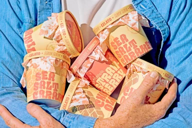
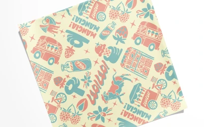
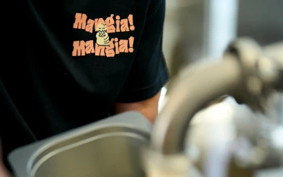
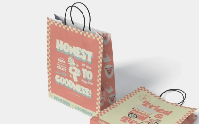
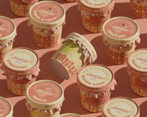
The brand identity for Leo! Leo! establishes a cohesive visual language across its gelato and sorbetto packaging, merchandise, and environmental assets. Graphic design by Studio Ethur Ethur integrates custom, retro-inspired typography with a warm, playful color palette of coral red, turquoise, and cream. The system leans into mid-century aesthetics through intricate illustrative patterns, balancing bold sans-serif lettering with a clean, minimalist approach. Captured by photographer Russell Holliday, the project documents the brand across both controlled product photography and lifestyle imagery. The execution relies on natural light to highlight textures across matte paper packaging and communal dining settings, maintaining a consistent commercial tone. By pairing structured typography with expressive motifs, the identity presents a unified visual narrative for the food and beverage brand.
Horizontal, Commercial, Clean
Natural light
Advertising Campaign

