
BrandLeo! Leo!
ProjectBrand Identity
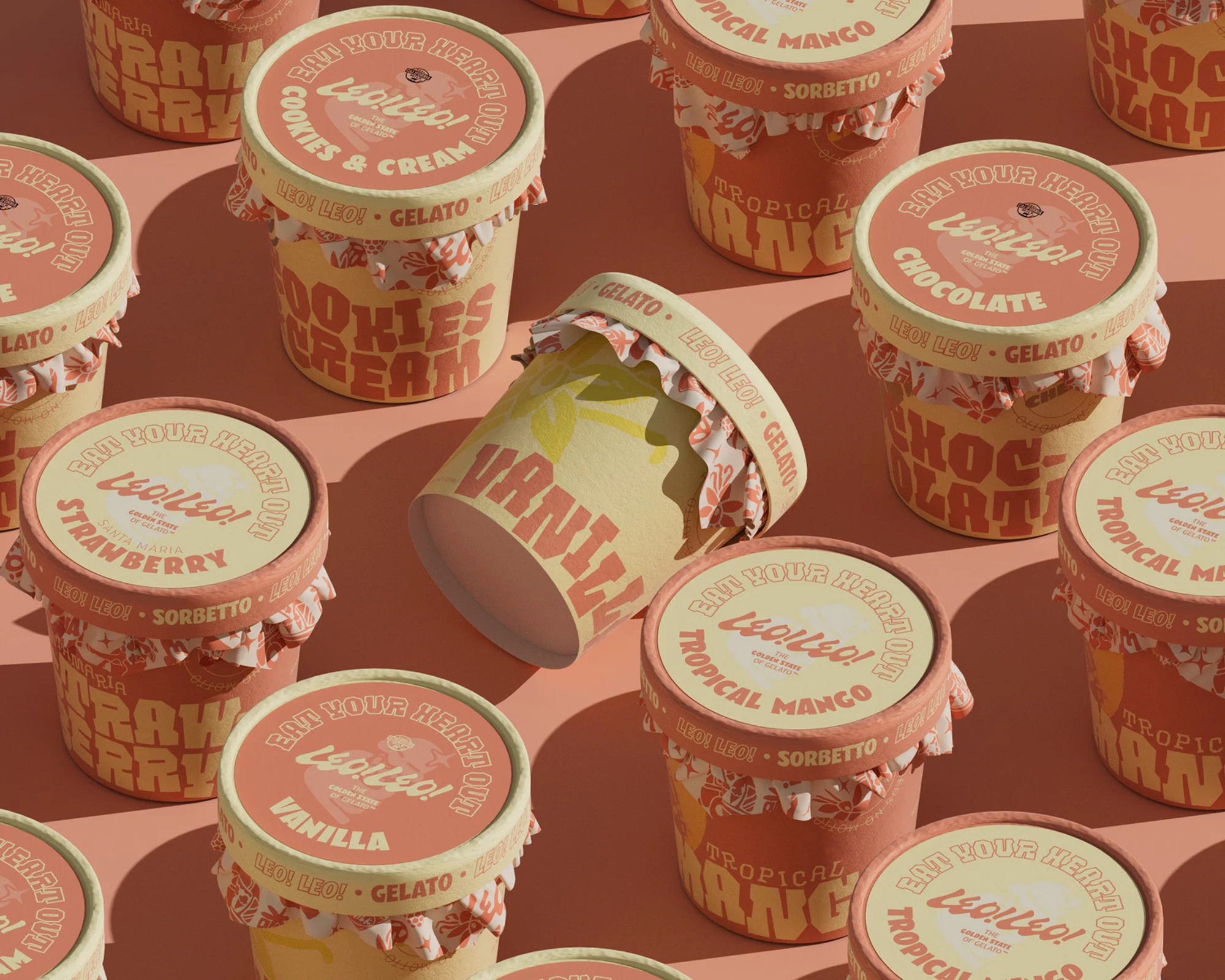
Leo! Leo! Brand Identity 2024
Associated creatives


Tags
Description
Product photography showcasing brand identity design for Leo! Leo! gelato and sorbetto. Multiple paper ice cream tubs are arranged in a repeating pattern across a warm, neutral surface under natural direct sunlight creating sharp shadows. The packaging features retro-inspired typography, custom illustrations, and distinct colorways for various flavors including strawberry, vanilla, chocolate, and tropical mango. Studio Ethur Ethur handled the graphic design, while Russell Holliday captured the photography for the project.
Style
Horizontal, Commercial, Warm, Minimalist
Techniques
Natural light
Industries
CPG / Packaged Food
Color
Rust (50%)
Camel (40%)
Off-White (10%)
Background
Solid Colour
Context
E-commerce / Product