
BrandLeo! Leo!
ProjectBrand Identity
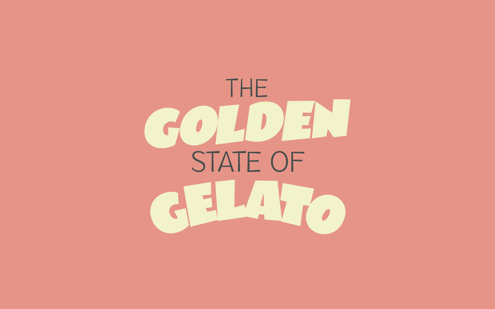
Leo! Leo! Brand Identity 2024
Associated creatives


Tags
Description
Graphic design piece created for the Brand Identity project by Leo! Leo!, featuring bold custom typography centered against a solid coral pink background. The text layout features the words The Golden State of Gelato, rendered in a playful combination of dark grey sans-serif lettering and cream-coloured rounded block characters. The composition is clean and minimalist, relying entirely on typography and a warm, contrasting color palette to communicate the brand identity. Studio Ethur Ethur provided graphic design, with photography by Russell Holliday.
Style
Horizontal, Commercial, Clean, Minimalist
Techniques
Typography
Industries
Fast Food
Color
Terracotta (70%)
Cream (30%)
Background
Solid Colour
Context
Digital / Display Advertising