
Brand
ProjectBrand Identity
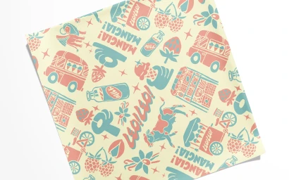
Leo! Leo! Brand Identity 2024
Associated creatives


Tags
Description
This brand identity project for Leo Leo features a playful, retro-inspired illustrated pattern rendered in a two-color palette of coral red and turquoise blue on a cream background. The repeating pattern includes charming graphic motifs such as vintage ice cream trucks, milk bottles, strawberries, raspberries, and typography reading Mangia and Leo Leo. The flat graphic style exhibits crisp lines and a nostalgic aesthetic reminiscent of mid-century packaging design. The composition is presented square on a flat surface, highlighting the detailed illustrative elements created by Studio Ethur Ethur and photographed by Russell Holliday.