
Leland: Brand Identity
Feb 2021
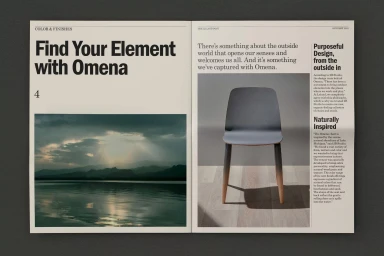
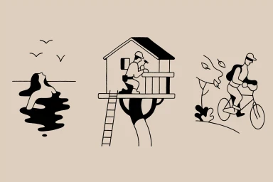
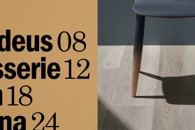
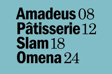
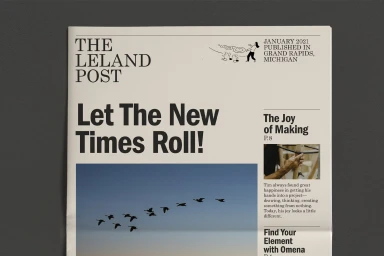
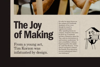
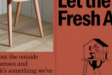
Leland’s brand identity project serves as a comprehensive exploration of minimalist design, blending structured editorial layouts with conceptual visual storytelling. Developed by Clase, the project utilizes a sophisticated typographic hierarchy paired with clean, bold sans-serif and serif fonts to anchor its modern aesthetic. Illustrations by Miguel Porlan introduce narrative elements throughout the collateral, featuring vector-based line art that complements the furniture-focused product photography. The application of natural light and consistent, earthy color palettes—ranging from pale blue to terracotta—creates a cohesive visual system across newspaper spreads, brand publications, and identity presentations.
Horizontal, Clean, Minimalist
Typography
Advertising Campaign

