
VOL: Brand Identity
Sep 2019
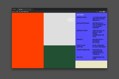
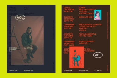
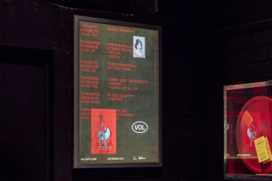
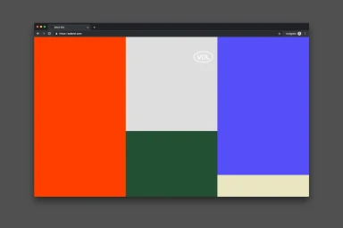
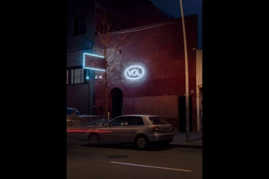
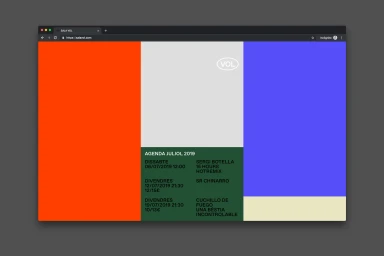
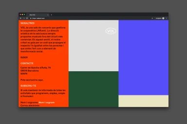
The brand identity for VOL represents a masterclass in contemporary event-driven graphic design, seamlessly bridging the gap between digital interface and physical space. Orchestrated by the design agency Clase, the visual language revolves around a robust, modular grid system that prioritizes clarity and high-impact visual communication. Across both the venue website and event collateral, the identity leans into a striking palette of high-saturation geometric color blocks—ranging from vibrant orange to deep forest green—which provides a consistent, memorable foundation. This minimalist approach is punctuated by a stark, sans-serif typography that ensures the information-heavy concert schedules remain readable while maintaining a premium aesthetic. The execution of the project is consistently rooted in UI illustration and vector design, which grants the brand a clean, professional edge suitable for corporate applications in the arts and culture sector. Beyond the digital screen, the identity translates effortlessly into the physical world, exemplified by the atmospheric neon signage and high-contrast concert posters that utilize layered, cinematic framing. By balancing strict structure with bold, rhythmic color application, Clase has successfully forged an identity for VOL that feels both institutional and avant-garde, capturing the pulse of the concert experience through a lens of editorial minimalism and deliberate, graphic precision.
Horizontal, Commercial, Graphic
Typography
Advertising Campaign
