
Laka: Brand Identity

Aug 2020
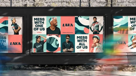
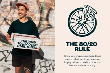
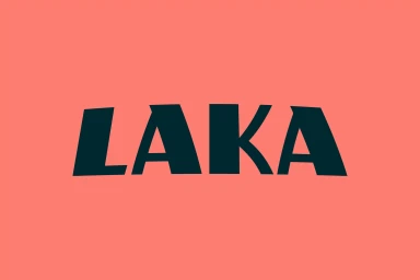
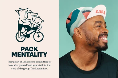
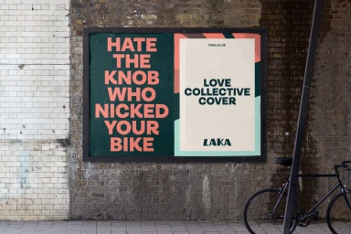
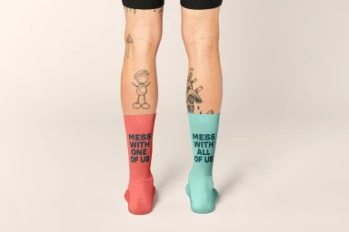
The brand identity project for Laka masterfully blends athletic culture with a playful, high-contrast visual language that feels both urban and deeply human. Executed by the team at Ragged Edge, this comprehensive design system elevates the cycling brand through a sophisticated use of minimalist, flat aesthetic principles and a vibrant, warm color palette dominated by coral pinks, deep teals, and soft mint greens. The branding leans into a collaborative ethos, effectively utilizing typography and character illustration to articulate the company mission of unity and support within the cycling community. Whether through expansive outdoor advertising billboards or intimate product photography featuring natural light and soft textures, the identity remains consistent and punchy. The integration of live-action technique alongside vector-based UI illustration creates a dynamic balance, allowing the brand to appear approachable yet professional. By pairing bold sans-serif typefaces—most notably seen in the defiant 'MESS WITH ALL OF US' campaign messaging—with organic, flowing shapes, Ragged Edge has built an identity that feels distinctly modern and structured. This project stands as a testament to how cohesive corporate branding can embrace character-driven storytelling without sacrificing visual clarity, resulting in a cohesive brand presence that successfully resonates with its audience across both digital and physical touchpoints.
Horizontal, Commercial, Graphic
Typography
Advertising Campaign
