
The Twenty One: Brand Identity
Sep 2024
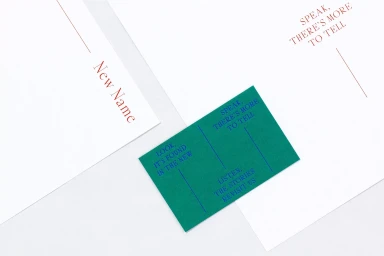
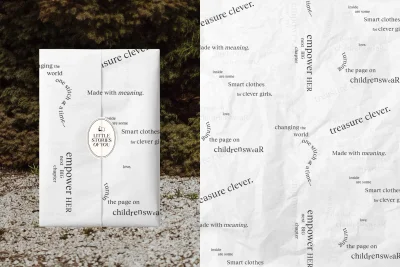
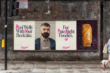
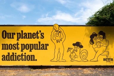
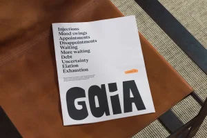
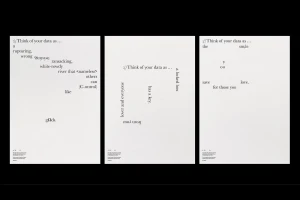
The Twenty One brand identity project establishes a comprehensive visual language through a mix of minimalist graphic design and dynamic motion content. The project features clean, serif-driven typography applied across diverse media, including corporate stationery, packaging, and large-scale outdoor advertising. Executed with a focus on negative space and tactile material finishes, the design employs a palette that transitions from neutral white and brown leather textures to high-contrast, vibrant yellow displays featuring whimsical black-line illustrations. Creative direction is led by Visie Admin, with collaborative graphic design contributions from Marlon Tate, UnitedUs, Ragged Edge, Anak, Accept & Proceed, and A Practice for Everyday Life. The output ranges from static, concept-heavy posters to kinetic motion graphics that integrate archival footage with contemporary lifestyle scenes. The campaign leans into a modular aesthetic, utilizing bold text callouts and experimental typographic alignments to convey brand messaging.
Horizontal, Commercial, Clean


