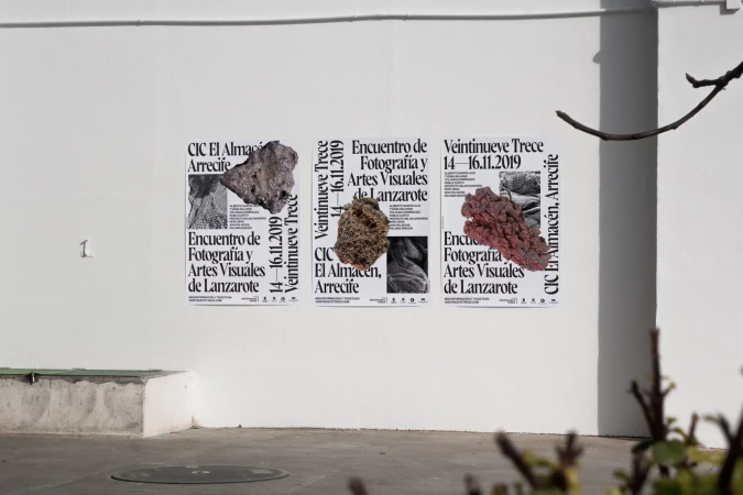
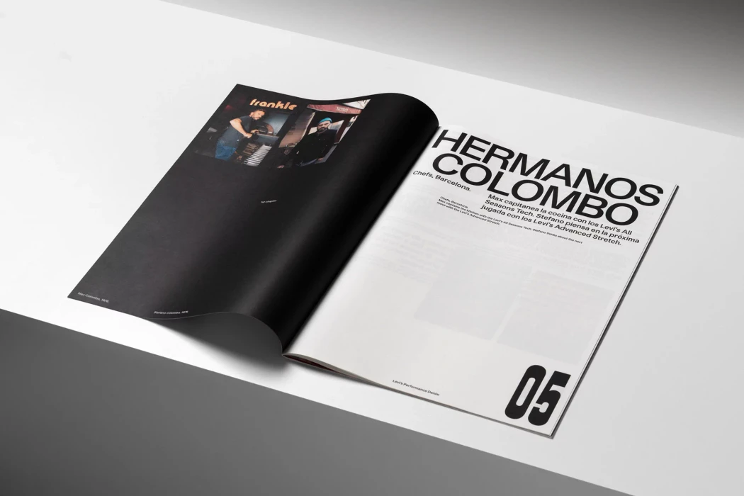
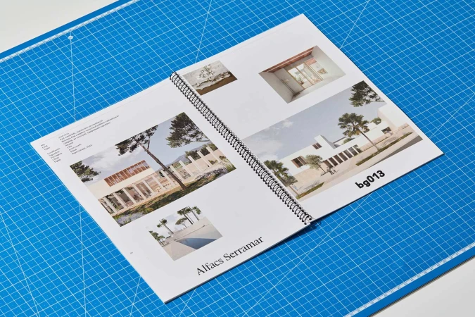
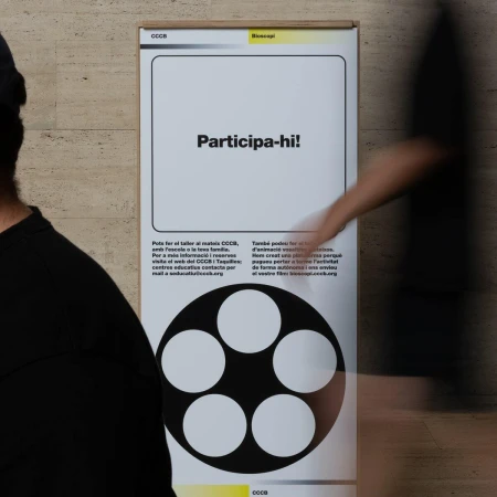
The brand identity developed for the Institut d'Estudis Catalans marks a sophisticated intersection of academic rigor and contemporary visual communication. Tasked with commemorating the International Year of the Periodic Table, the project relies on a sharp, minimalist aesthetic that translates complex scientific concepts into highly legible graphic systems. Graphic designer León Romero anchors the identity in a bold, reductive language where abstract molecular-style illustrations collide with clean, sans-serif typography. This visual narrative is executed with precision across a diverse range of touchpoints, from tactile printed materials like vibrant lime-green brochures to large-scale exterior environmental signage. By leveraging high-contrast color palettes and thoughtful composition, the project leans into editorial minimalism to maintain clarity while ensuring the institute's presence remains striking in both digital media and physical spaces. The use of natural light and tactile paper stocks in the promotional photography underscores a commitment to materiality, bridging the gap between historical institutional identity and modern commercial design. Throughout the series, the consistent application of these molecular motifs and structured type creates a cohesive brand ecosystem that feels at once timeless and distinctly urgent. This identity succeeds by stripping away excess, allowing the clean, geometric lines to communicate the profound significance of the Periodic Table within a modern, professional workspace context, proving that even the most technical information can be elevated through intentional, sophisticated graphic design.