
Levi's: Brand Identity

Apr 2020
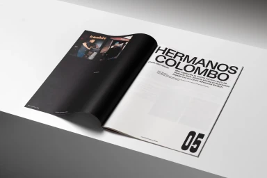
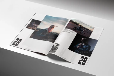
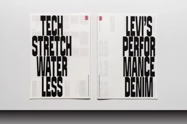
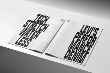
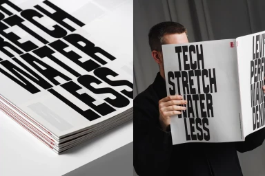
Levi's recent brand identity refresh masterfully bridges the gap between heritage denim and modern technical performance, articulating the brand's evolution through a sophisticated editorial lens. Executed with sharp, minimalist sensibilities, this campaign treats corporate communication as an art form, utilizing high-contrast typography and bold, sans-serif layouts to drive home the messaging behind their All Seasons Tech and Advanced Stretch apparel lines. The project, brought to life through the precise graphic design of León Romero, relies on an interplay of negative space and stark white backgrounds to elevate the brand's iconic aesthetic. By layering long-form narratives—such as the profile of the Hermanos Colombo—with gritty, live-action technique photography of cyclists and chefs, the collateral feels less like a corporate brochure and more like a curated lifestyle magazine. The use of cinematic lighting in lifestyle imagery perfectly balances the clinical precision of the infographics and technical spec-sheets, creating a cohesive visual ecosystem that feels both accessible and aspirational. Throughout the various magazine spreads and advertising booklets, the design avoids clutter, letting the subtle red brand tags and punchy, condensed headers do the heavy lifting. This approach to brand identity effectively leans into a contemporary aesthetic, proving that even globally recognized performance denim can find new life through clean, intentional print design that commands attention through sheer graphic clarity.
Editorial, Horizontal, Clean
Typography
