
Impira: Brand Identity


Nov 2019
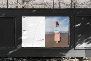
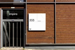
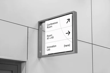
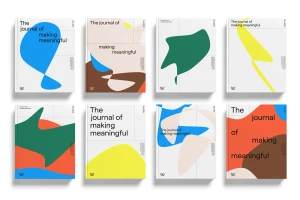
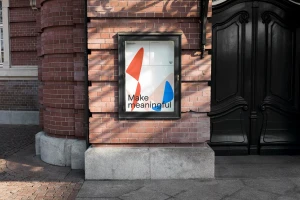
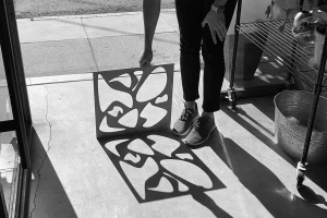
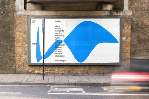
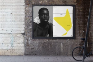
The Impira Brand Identity project serves as a masterclass in modern corporate communication, bridging the gap between high-level utility and expressive visual storytelling. Developed by DesignStudio, the system leans into a minimalist aesthetic that prioritizes clarity while maintaining a distinct, tactile personality across a diverse range of touchpoints. From the architectural precision of office wayfinding and site signage to the sophisticated, debossed business cards that elevate everyday professional exchange, every element feels intentional and refined. The identity is anchored by a clean, sans-serif typography system that manages to feel both institutional and human, particularly when juxtaposed against the fluid, abstract graphic illustrations that characterize their editorial collateral. By utilizing a high-contrast palette and exploring light through natural light photography and hard light techniques, the project breathes life into static environments. Whether it is an outdoor billboard mounted against weathered brick or a custom patch on a knitted beanie, the brand manages to maintain a cohesive visual language that remains flexible across commercial and artistic contexts. The result is a comprehensive corporate identity that does not merely label a business, but actively reinforces the core ethos of making things meaningful, proving that even the most technical brands can find a soulful and resonant voice through disciplined, thoughtful design execution.
Horizontal, Commercial, Clean, Minimalist
