
Onefootball: Brand Identity


Jul 2020
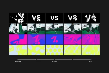
In the fast-paced realm of apps and digital platforms, Onefootball has undergone a radical transformation, establishing a fresh brand identity that bridges the gap between raw stadium energy and high-end digital precision. Through a comprehensive design overhaul, the project leans into a bold, modern graphic language that moves away from traditional sports cliches, opting instead for a striking visual ecosystem. The core of this refresh centers on a custom, geometric sans-serif typeface, characterized by sharp, angular cuts that feel both authoritative and contemporary. This typography is supported by a vibrant, high-contrast color palette of neon pinks, electric blues, and lime yellows, which provide a rhythmic tension against the brand's signature minimalist dark-mode foundations. DesignStudio has masterfully extended this visual lexicon across multiple touchpoints, ranging from sophisticated UI illustration on mobile interface cards to physical merchandise like custom-knitted scarves and technical apparel. By integrating these complex typography and motion graphics elements into a cohesive system, the brand successfully articulates a identity that is as much at home on a city billboard as it is within a user-centric app interface. The final result feels remarkably fluid, successfully balancing a stark, industrial aesthetic with the dynamic intensity of the beautiful game, proving that corporate branding can be both highly structural and deeply expressive in a crowded digital landscape.
Commercial, Graphic, Horizontal
Typography
Advertising Campaign
