
Oberlo: Brand Identity


Brand
Date
Oct 2020
Description
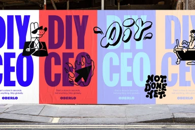
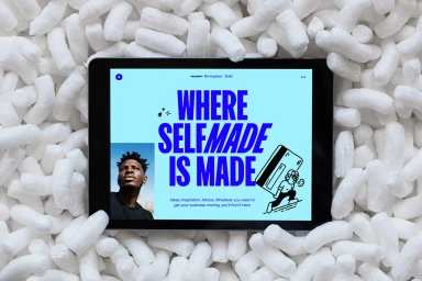
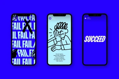
Oberlo’s brand identity project establishes a visual language defined by playful character illustrations and bold, expressive typography. The system integrates a vibrant color palette with varied graphic motifs, leaning into retro-inspired aesthetics and clean, minimalist compositions to define its platform presence. Developed in collaboration with DesignStudio, who led the graphic design, the project features illustrative contributions from Appear Offline and Guy Field. Across digital mockups, out-of-home billboard installations, and motion graphics, the identity utilizes vector-based designs and 3D render techniques to bridge the gap between abstract art and functional application interfaces.
Style
Horizontal, Commercial
Industries
Color
Royal Blue
Background
Solid Colour
Associated creatives


5000+ creatives to discover
Sign up to gain access to the entire directory. It’s free.
Visie is a curated library of creative professionals.