
Getsafe: Brand Identity
Jun 2020
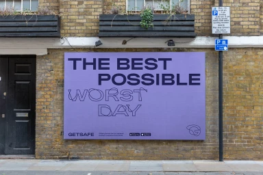
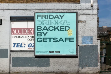
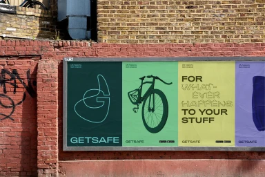
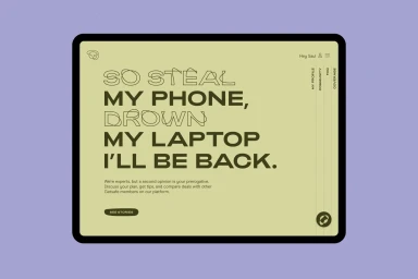
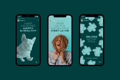
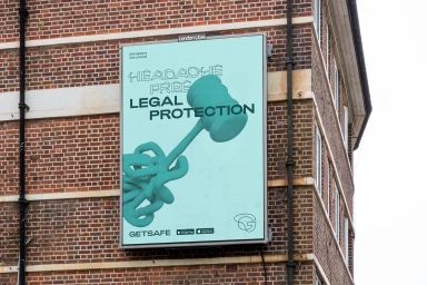
In a bold pivot for the insurance and finance sector, Getsafe has unveiled a refreshed brand identity that deftly bridges the gap between digital utility and physical environment. Spearheaded by the creative minds at DesignStudio, the campaign moves away from industry tropes, instead leaning into a vibrant, modern aesthetic that feels as comfortable on a handheld smartphone interface as it does on a weathered urban brick facade. The project masterfully employs distinct typography and high-impact graphic design, using bold sans-serif text layered against clean, flat-color backgrounds. By juxtaposing polished digital-style UI illustrations against the raw textures of city infrastructure, the brand creates a compelling dialogue between modern protection and everyday life. The visual language utilizes a sophisticated, playful palette of lavender, olive green, and mint, anchored by sharp 3D render / CGI elements like a stylized turquoise gavel or a sculptural pet icon. Whether through commercial billboards that demand attention on a busy street or the minimalist, user-centric mobile experience, the work remains consistently punchy and accessible. This identity overhaul channels a refreshing sense of clarity, utilizing editorial minimalism and strategic data visualisation to transform the abstract concept of insurance into something tangible, relatable, and visually arresting, proving that financial service design can be as creatively expressive as it is functionally essential.
Horizontal, Commercial, Clean
