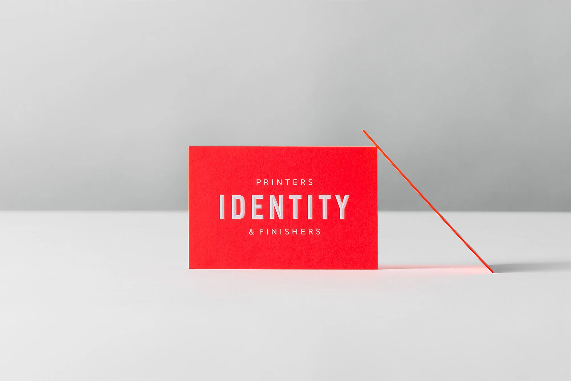
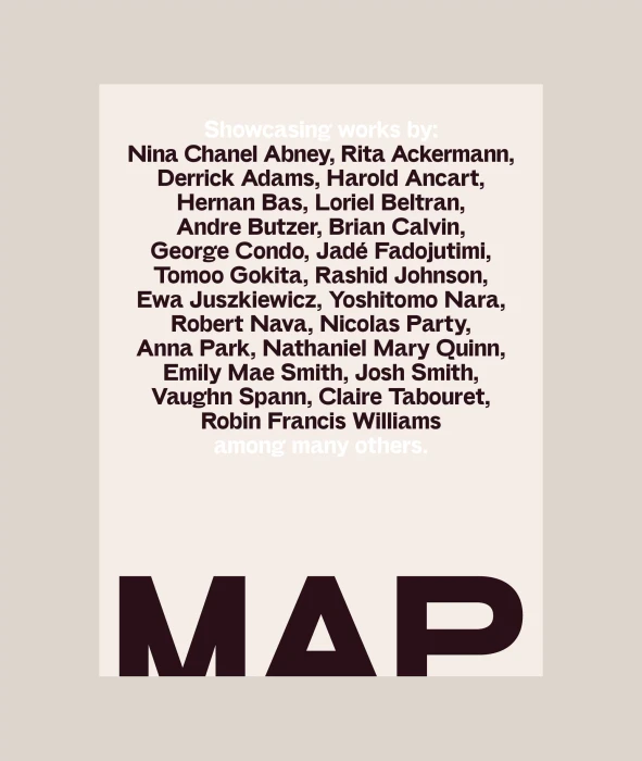
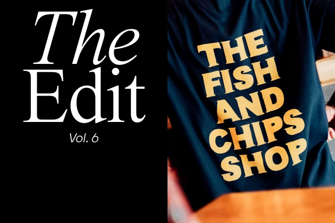
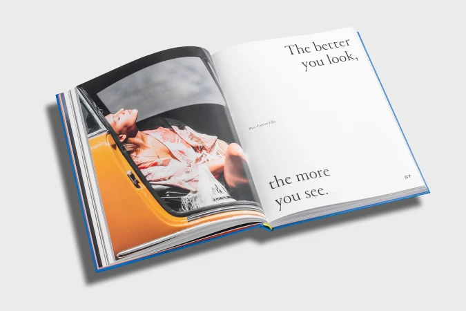
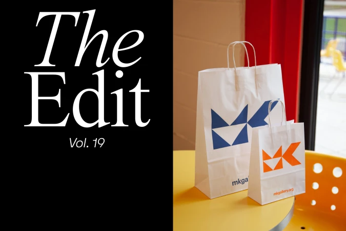
This expansive showcase of brand identity design demonstrates a masterclass in visual precision, pulling together diverse corporate identities under a unified, polished lens. Through a series of commercial photography assets, the project highlights how deliberate typography and tactile material choices can elevate a brand's narrative from the mundane to the memorable. The work, featuring contributions from studios including Morse Studio, Motley, ILVZ Estudio, Roser Padrés, and Praline, captures a spectrum of visual languages—from the clinical, high-contrast geometry of modern skincare packaging rendered in hard light to the soft, editorial minimalism of high-end interior design branding. Across these varied applications, the execution leans into a sophisticated, monochromatic aesthetic, favoring crisp sans-serif typefaces and clean, uncluttered compositions. Techniques such as deliberate emboss and deboss applications, coupled with a keen eye for soft light, lend a physical, premium quality to business cards and marketing collateral. By juxtaposing stark, graphic elements against weathered urban textures or refined stone surfaces, the collective portfolio frames branding as an exercise in balance and restraint. Whether utilizing a bold, saturated red to command attention or relying on subtle, muted beige palettes to communicate luxury, the project consistently emphasizes the cohesive application of design across physical and digital mediums, proving that a strong visual system is the foundation of any enduring commercial presence.