
Richard Rogers Fellowship
Brand Identity

Jan 2017
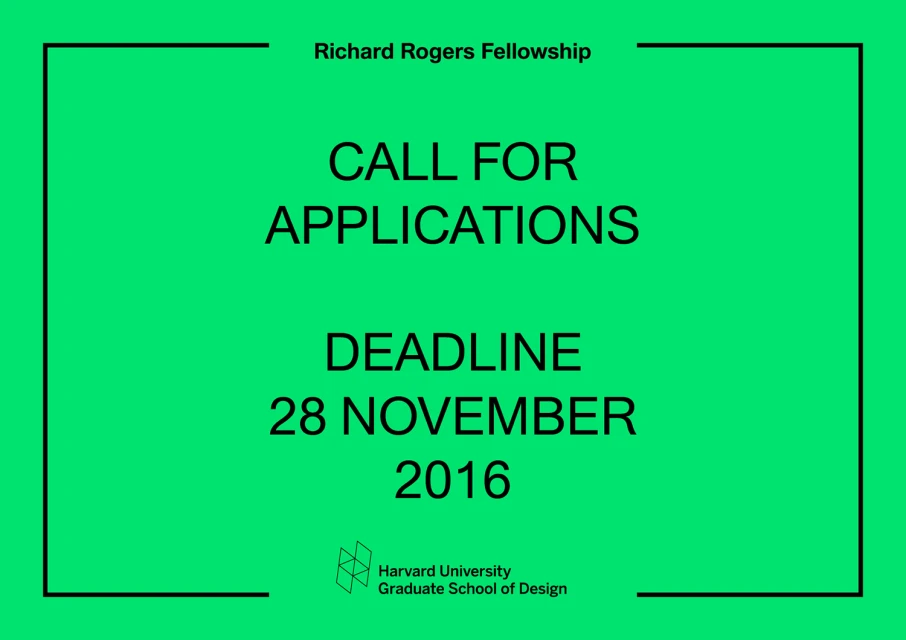
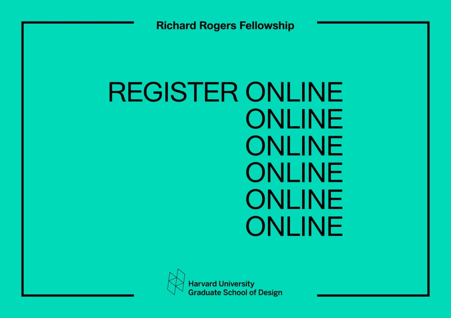
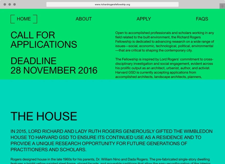
The brand identity for the Richard Rogers Fellowship, developed by the design studio Praline, masterfully navigates the intersection of academic rigor and contemporary visual communication. Operating within the spheres of digital media and publishing, the project serves as a definitive case study in institutional branding that refuses to sacrifice clarity for aesthetic flair. The work centers on a structural, high-contrast visual language that leans into corporate minimalism, utilizing a punchy, saturated palette of intense greens and neon yellows to cut through the noise of traditional architectural discourse. By employing clever color blocking and clean, sans-serif typography, the design ensures that critical information regarding residency applications and deadlines remains the primary focus. The technical execution relies heavily on vector-based precision, resulting in a flexible system that translates seamlessly from static print posters to the immersive, browser-based UI illustrations seen across the fellowship website. This editorial-style approach effectively bridges the gap between the historic significance of the Wimbledon House and the forward-looking mission of the Harvard University Graduate School of Design. Every element, from the stark split-screen compositions to the recurring vertical text layouts, is purposefully arranged to communicate the fellowship’s dedication to research within the built environment. Praline has successfully created a cohesive, functional identity that honors the fellowship’s stature while maintaining a distinct, modern identity that resonates with a global audience of researchers and designers.
Graphic, Horizontal, Commercial
Typography
Solid Colour
Advertising Campaign
