
The Fish And Chips Shop: Brand Identity



Jan 2020
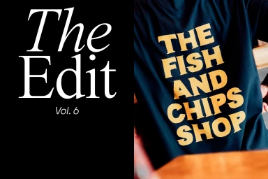
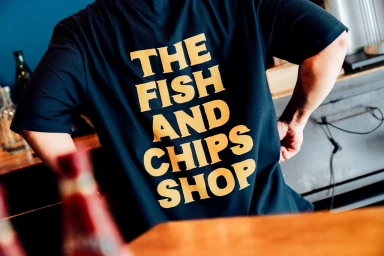
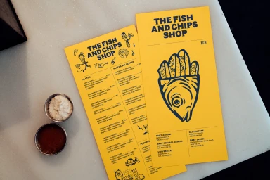
The brand identity for The Fish And Chips Shop marks a sophisticated evolution in commercial design, masterfully bridging the gap between utilitarian service aesthetics and elevated graphic communication. Crafted with a keen eye for minimalist industrial influences, the visual system leans into a high-contrast palette that balances clean white surfaces with bold, assertive typography. Through the implementation of live-action techniques, the project captures a tactile sense of place, grounding the brand within a contemporary casual service environment defined by concrete textures and crisp, functional geometry. The identity utilizes a sharp interplay between stark black-and-white compositions and vibrant pops of gold and mustard yellow, effectively anchoring the brand across diverse touchpoints ranging from takeaway packaging to meticulously arranged flat-lay stationery. By emphasizing a rigorous visual hierarchy and clear, sans-serif messaging, the creative team—encompassing the specialized expertise of Jordi Masdeu Studio, ILVZ Estudio, Familia, and Make Future—has constructed a cohesive ecosystem that feels both professional and approachable. This work functions as a masterclass in modern commercial design, proving that even the most grounded, service-oriented industries can benefit from an editorial sensibility. The result is a seamless, highly legible identity that maintains its visual integrity whether presented on a staff uniform, a folded paper menu, or complex food packaging, ensuring the brand remains consistently sharp in any light.
Clean, Horizontal, Commercial
Advertising Campaign


