Logo
An open hardcover book displaying a photograph of a woman resting against a yellow car alongside bold typographic text on a white page.
Open book page showing a silhouette of a woman standing by large industrial windows next to a red sphere chair
An open photo book showing a yellow sports car detail on the left page and a smaller photo of a car on the right page.
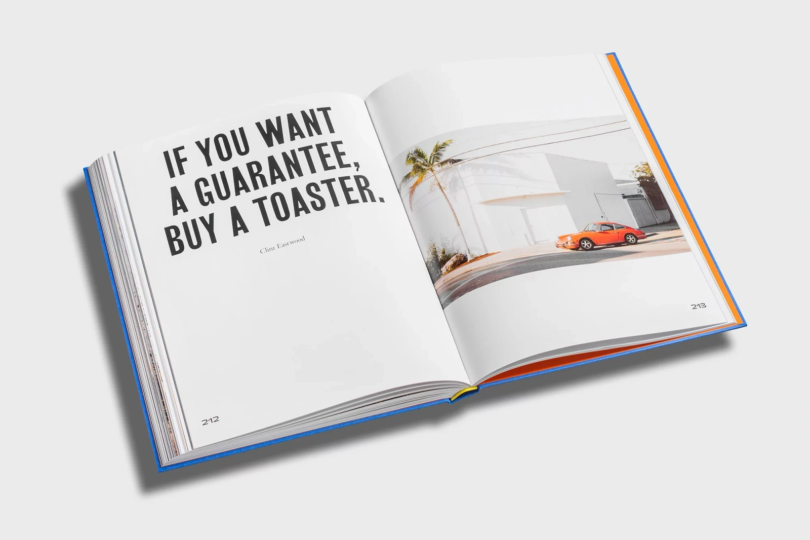
An open book on a white surface featuring bold typography on the left page and an orange sports car parked by a white building on the right.
Close-up of an open hardcover photography book featuring a vibrant magenta and orange page opposite a black and white portrait.
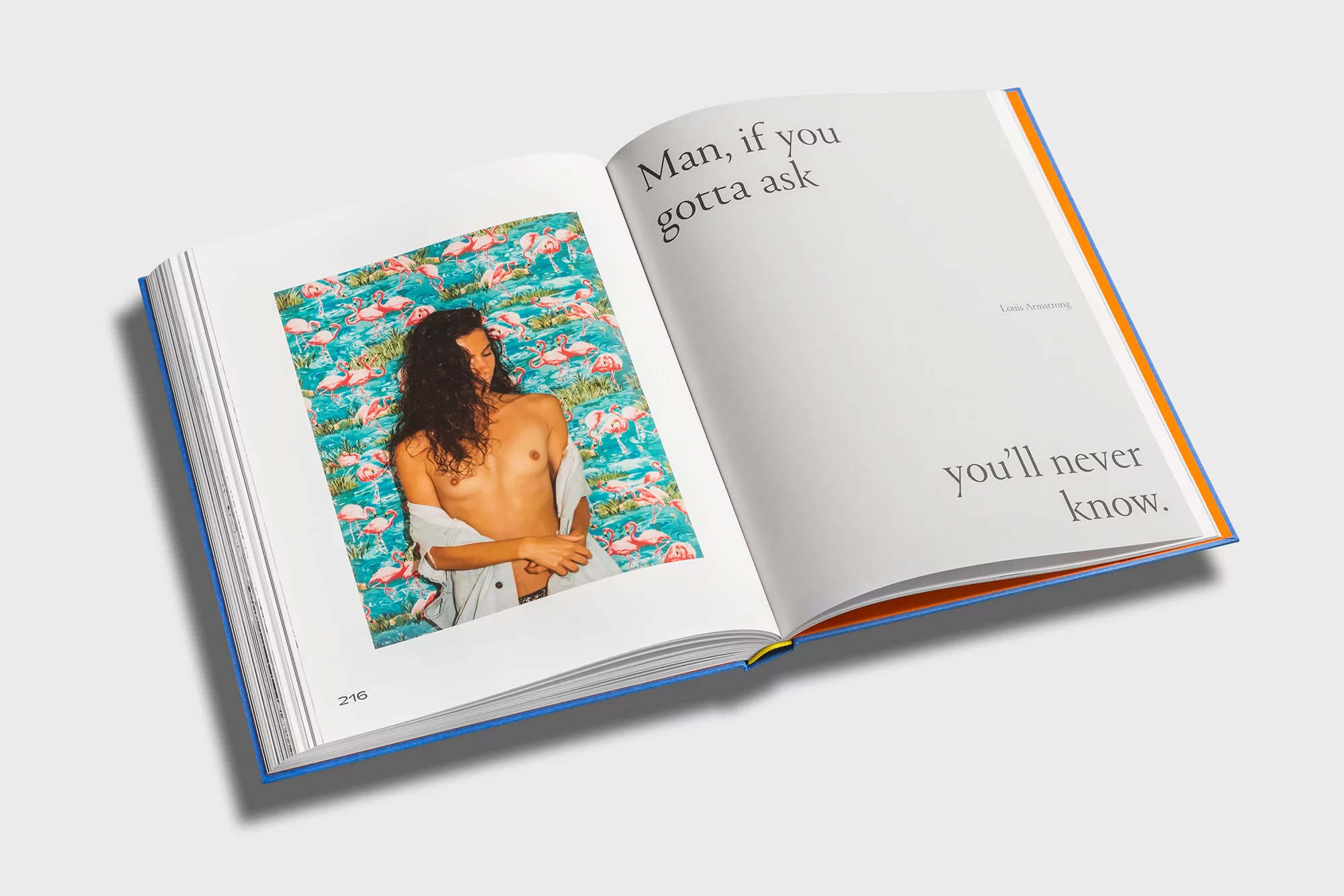
Open book spread showing a photograph of a person against a flamingo patterned background and typography on the right page
Close-up angled view of a blue book spine with embossed Vince Perraud branding and a photography print cover on a light grey background.
Storefront glass door featuring bold yellow typography spelling GET IN with dark textured tile facade
Blue hardcover photography book titled Get In by Vince Perraud resting on a white surface with drop shadow
An open hardcover book displaying a photograph of a woman resting against a yellow car alongside bold typographic text on a white page.
Open book page showing a silhouette of a woman standing by large industrial windows next to a red sphere chair
An open photo book showing a yellow sports car detail on the left page and a smaller photo of a car on the right page.

Vince Perraud Brand Identity 2020

About

The brand identity for Vince Perraud, developed in collaboration with Praline, serves as a masterclass in editorial minimalism and visual storytelling within the media and entertainment industry. By seamlessly bridging the gap between high-end commercial publishing and personal archive, the project manifests as a tactile, hardbound testament to Perraud’s photographic vision. The identity leans heavily into cinematic aesthetics, utilizing a sophisticated interplay of bold, sans-serif typography and high-contrast color blocking to ground the imagery. Each spread, from the saturated, natural light captures of vintage cars to the intimate, low-key silhouettes in urban lofts, feels curated for impact rather than mere documentation. The design utilizes sharp live-action techniques to maintain a sense of momentum, while the consistent use of debossed detailing and vibrant color accents on the book’s spine reinforces a cohesive, professional aesthetic. Beyond the pages, the identity extends to environmental graphics, seen in the stark, high-contrast storefront lettering that utilizes modern, clean typography to command space. This project functions as both a portfolio and a product, emphasizing how deliberate layout and a disciplined approach to whitespace can elevate documentary-style photography into a compelling brand narrative. Through this synthesis of form and content, the collaboration between Perraud and Praline creates a sensory experience that feels both contemporary and timelessly editorial.

Brand

Credits

Styles

Techniques

5000+ profiles to discover

Sign up to gain access to the entire directory. It’s free.

Visie is a curated library of creative professionals.
Trusted by