
MK Gallery: Brand Identity


Apr 2020
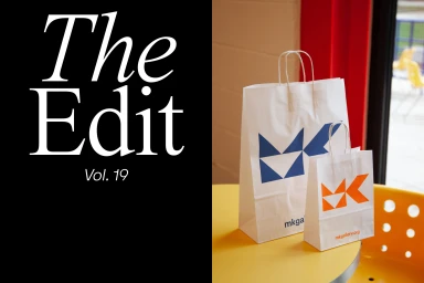
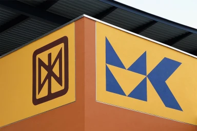
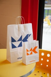
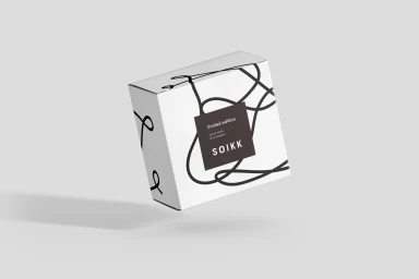
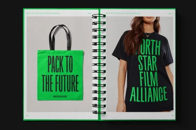
MK Gallery establishes a formidable visual presence through its latest brand identity project, a masterclass in geometric rigor and high-contrast graphic design. By leaning into a primary color palette punctuated by vibrant yellow, deep blue, and sharp black, the system achieves a sense of institutional permanence while remaining fluid enough for contemporary applications. The project manifests across an expansive range of touchpoints, from clean, architectural signage that utilizes hard light to emphasize crisp angles, to functional corporate collateral like lanyards and paper goods. The design language, executed with surgical precision, heavily prioritizes typography as a core structural element. Whether seen on physical packaging or in the sophisticated, minimalist layouts of brand guidelines, the identity channels a bold and direct communication style. Through the creative efforts of agencies such as AG Design Agency, fagerström, ILVZ Estudio, and BOND, the work achieves a cohesive, corporate aesthetic that feels both accessible and distinctly elevated. The inclusion of subtle, tactile elements—like the sharp contrast of paper stocks and the deliberate use of negative space—further refines the output, ensuring that the brand identity is as much about the physical experience as it is about visual impact. This is professional design at its most effective, balancing strict organizational requirements with a playful, energetic spirit that commands attention in any commercial context.
Horizontal, Commercial, Clean
Advertising Campaign


