
Hokum: Brand Identity



Oct 2020
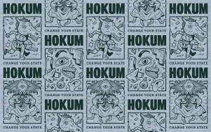
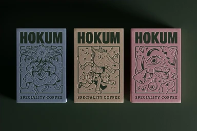
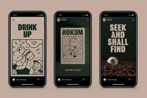
The brand identity for Hokum specialty coffee leans into a surrealist aesthetic to define its presence in the beverage market. The project combines graphic design by Jamhot, illustration from Boxdog Inc, and 3D visualization by Where Giants Roam to create a cohesive visual language that spans packaging, posters, and digital templates. Techniques such as 3D render / CGI and emboss & deboss highlight the brand's focus on tactile, clean compositions. The identity utilizes bold, dark green typography contrasted against pastel blocks and muted backgrounds, creating a minimalist yet distinct look across both physical and digital touchpoints. Illustrative patterns featuring fragmented facial features and abstract characters anchor the system, emphasizing a consistent, high-contrast aesthetic.
Horizontal, Commercial, Clean
Typography


