
Heyday: Brand Identity
Oct 2021
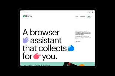
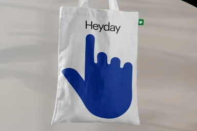
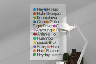
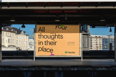
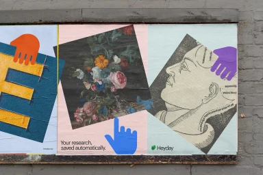
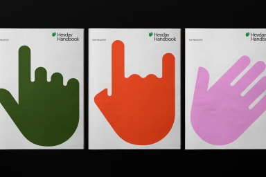
The brand identity for Heyday positions the research assistant tool through a blend of minimalist UI design and expressive graphic elements. The visual system, developed with graphic design by Order, centers on bold typography paired with a recurring series of colorful, hand-drawn illustrations that signify collection and organization. Across digital interfaces and physical touchpoints, the design maintains a clean aesthetic that bridges functional software communication with artful, contemporary motifs. The application of the identity spans from tablet-based browser assistant screens to exterior billboard advertisements and print materials, utilizing a cohesive palette of vibrant, solid-colored hand icons to anchor the brand across varied media.
Horizontal, Commercial, Clean, Minimalist
Typography
