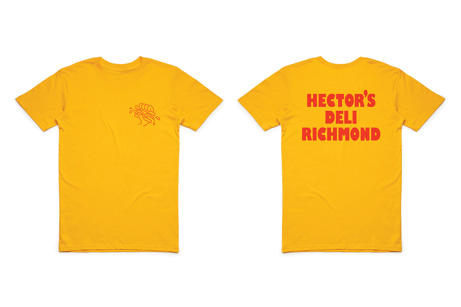
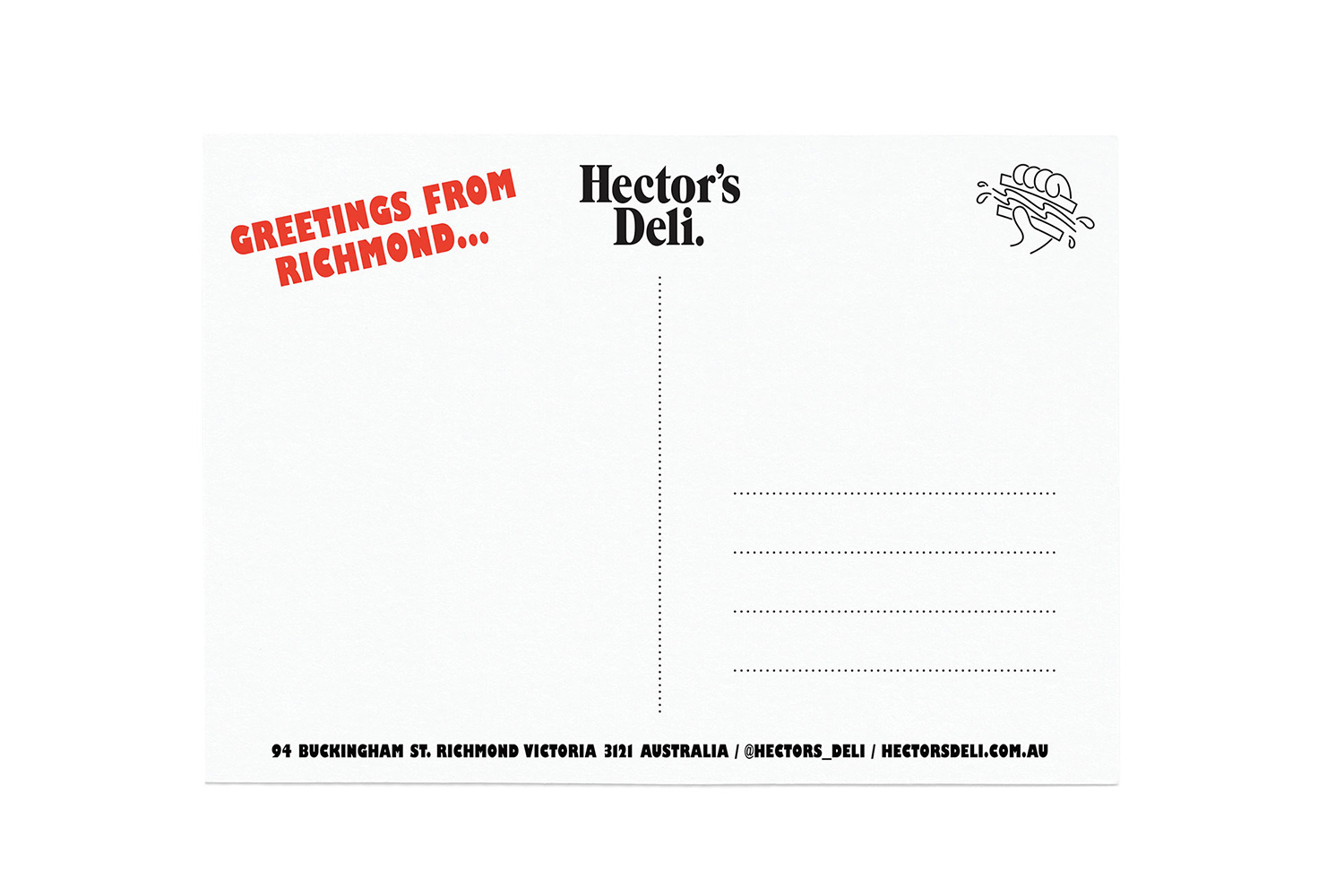
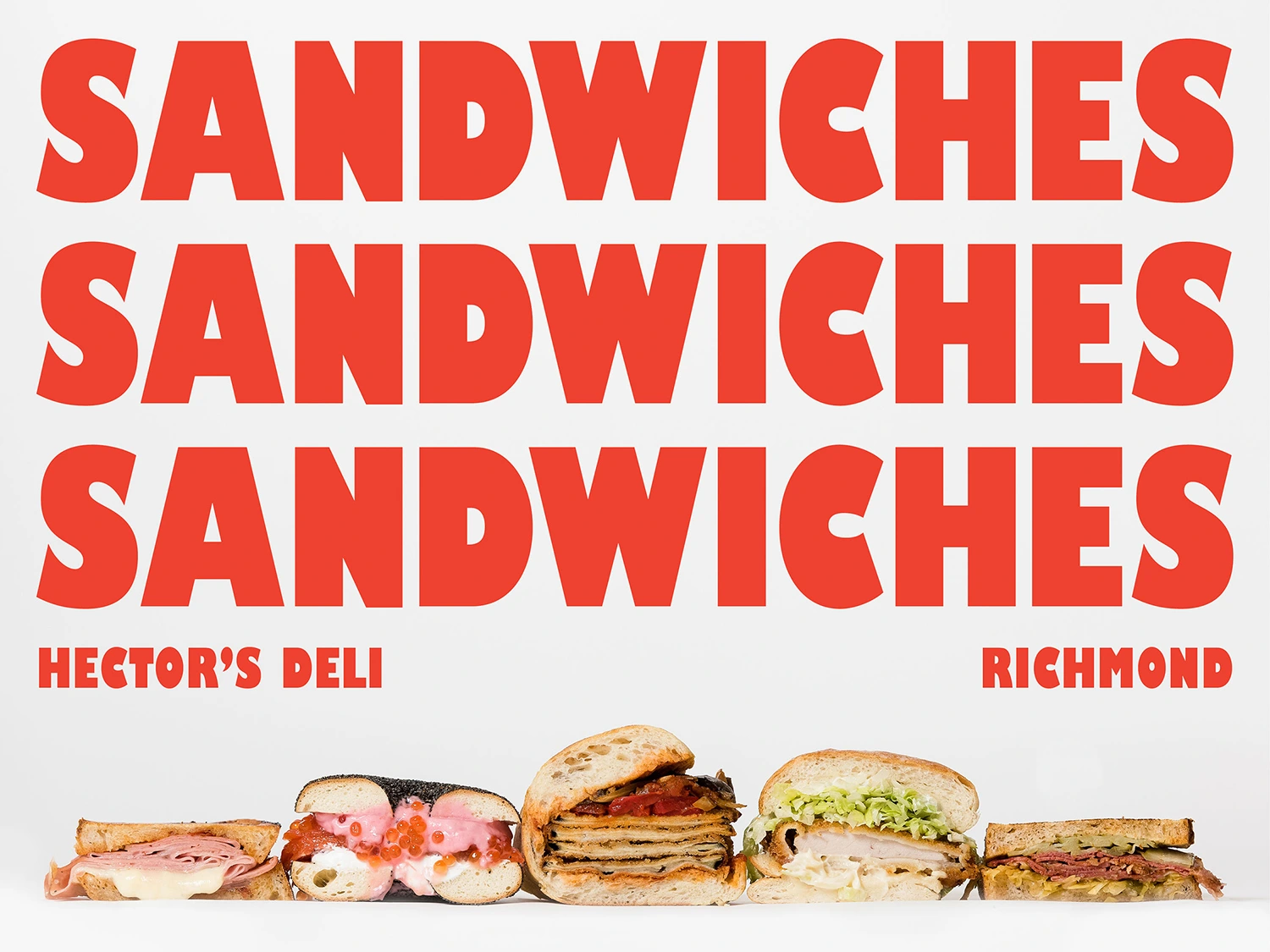
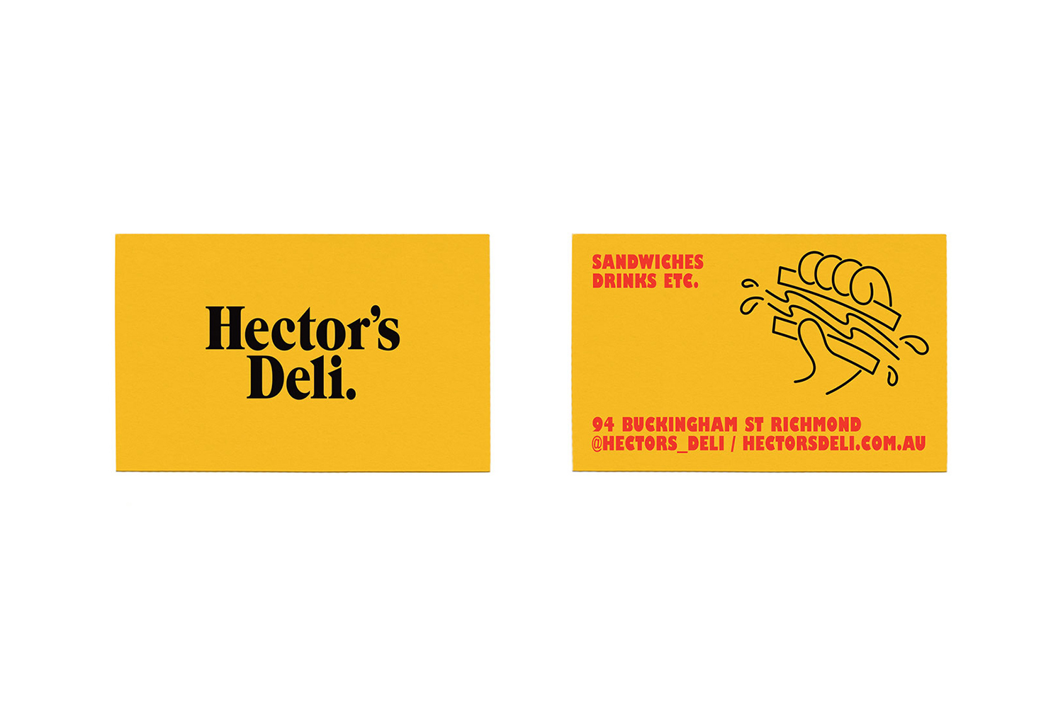
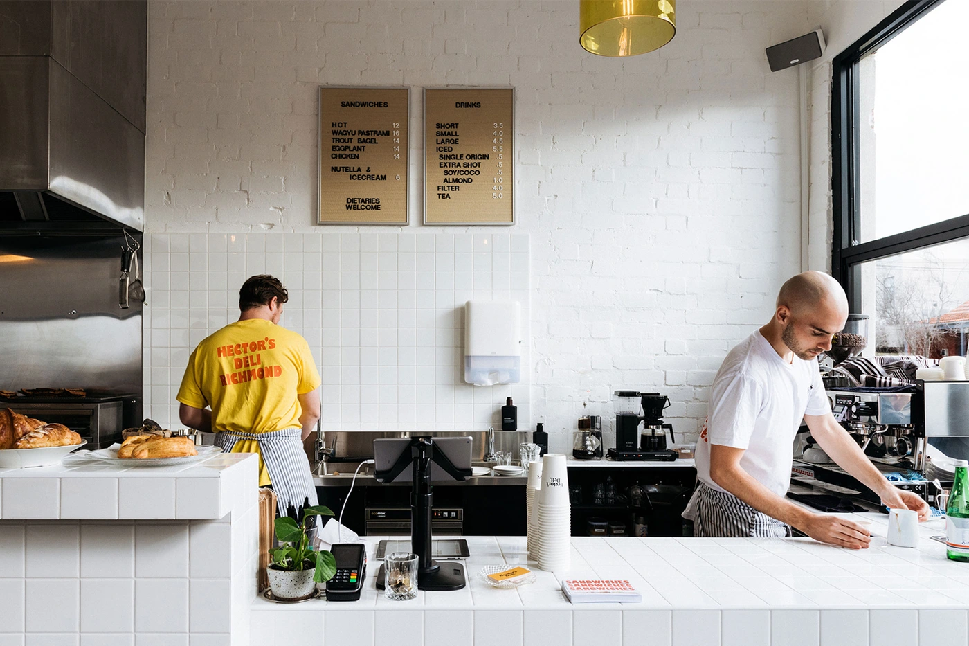
The brand identity for Hector's Deli represents a masterclass in minimalist culinary communication, expertly developed by the design studio Never Now. Within the competitive landscape of the food and beverage industry, the project creates a cohesive visual language that balances modern professional rigor with a playful, approachable character. By utilizing a high-contrast palette of vibrant yellow, bold red, and crisp black, the brand establishes an unmistakable presence across both physical collateral and digital touchpoints. The identity system thrives on a minimalist approach, employing clean vector line-art icons and assertive typography to anchor the brand's Richmond, Victoria location. From the structured grid patterns on packaging to the deliberate use of studio strobe photography that highlights gourmet ingredients against high-key white backgrounds, every asset feels purposeful and tightly edited. The apparel design, featuring simple red-ink illustrations on mustard-yellow cotton, reinforces the brand's status as a lifestyle-forward deli. Furthermore, the integration of candid, natural light photography documenting the daily operations of the service counter bridges the gap between static graphic design and authentic experience. By focusing on fundamental design principles—strong composition, functional typography, and consistent color usage—this project proves that sophisticated branding doesn't require visual clutter to make a significant impact, ultimately setting a high standard for how contemporary eateries should present themselves in an increasingly saturated market.