
Q Le BAKER: Brand Identity
Dec 2018
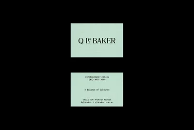
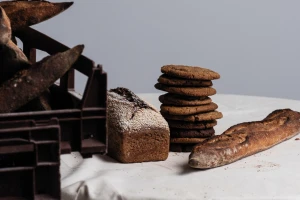
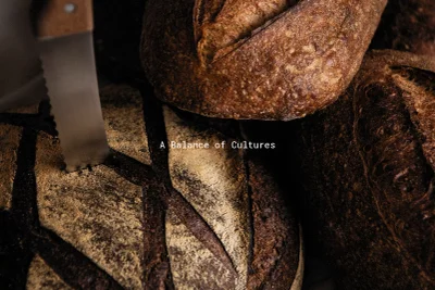
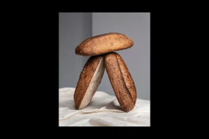
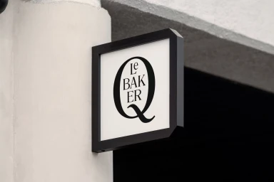
The brand identity for Q Le BAKER captures the intersection of artisanal craft and refined commercial design, establishing a visual language that feels both timeless and distinctly modern. Spearheaded by the design studio Never Now, the project leans into a minimalist aesthetic that prioritizes high-contrast typography and intentional negative space. By pairing a classic, elegant serif typeface with a soothing mint green palette, the identity successfully elevates the humble, earthy nature of a traditional bakery into a sophisticated, corporate-ready brand. The execution relies heavily on typographic precision, utilizing clean lines and symmetrical compositions that allow the brand name to serve as a strong, memorable anchor across both physical signage and printed collateral. Beyond the graphic elements, the project extends its identity through evocative commercial food photography that emphasizes the tactile, rustic qualities of the sourdough. Utilizing soft light and chiaroscuro techniques, these images highlight the flour-dusted, crusty textures of the baked goods, creating a cinematic dialogue between the product and the branding. This synthesis of clean, vector-based graphic design and moody, macro editorial photography creates a cohesive experience that feels rooted in heritage yet sharp enough for contemporary markets. The result is an identity system that balances professional rigor with the warmth of an artisanal kitchen, demonstrating how strategic visual balance can transform a local bakery into a premium, design-forward experience.
Horizontal, Commercial, Minimalist, Clean
Typography
Advertising Campaign
