
Changes: Brand Identity
Aug 2018
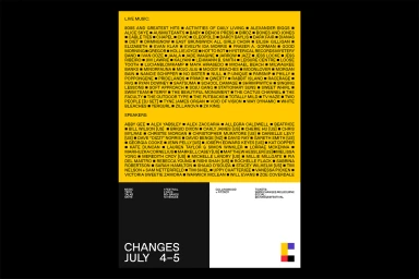
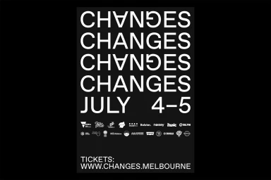
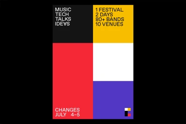
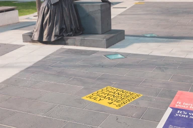
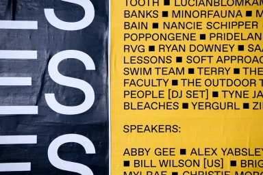
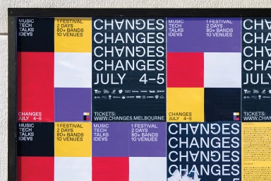
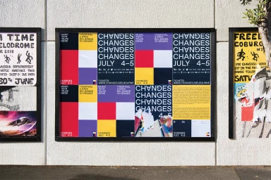
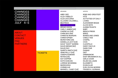
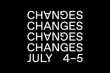
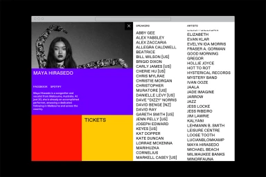
The brand identity for Changes, a multi-faceted event in the festivals and events sector, serves as a masterclass in modular graphic design and functional communication. Executed by the studio Never Now, the project channels a modernist sensibility, leaning into the power of a rigid, grid-based system to organize complex information. Across both digital interfaces and print collateral, the aesthetic relies on a high-contrast palette of yellow, red, purple, and black, which creates a rhythmic, pulsating visual hierarchy. The design avoids unnecessary flourish, instead opting for a clean, sans-serif typography that feels both urgent and highly accessible. By utilizing geometric blocks and repetitive typographic motifs, the identity remains consistent whether it appears on a website interface or as a weathered street poster on a concrete wall. The work successfully captures the kinetic energy of a festival environment, using artistic and commercial elements to bridge the gap between event promotion and contemporary corporate branding. Through a combination of editorial minimalism and tactile print textures—visible in the subtle creases of its pasted-up outdoor applications—the identity feels grounded in the urban landscape. This structured, vector-led approach ensures that the Changes festival is presented with absolute clarity, effectively managing the density of information while maintaining a sharp, unmistakable visual signature across all touchpoints.
Graphic, Horizontal, Commercial
Typography
Advertising Campaign
