
Havfram: Brand Identity

Jan 2021
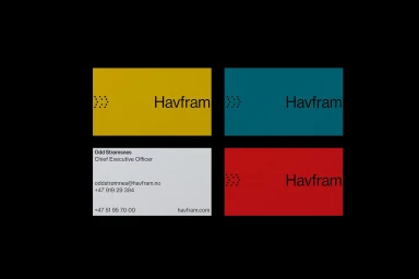
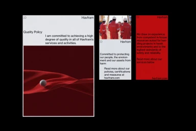
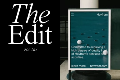
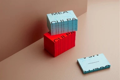
Havfram introduces a new brand identity characterized by a minimalist approach to corporate design. The system utilizes a structured layout, employing distinct colorways across stationery and environmental graphics. The aesthetic leans into clean typography and geometric motifs to maintain professional consistency across both print and digital applications. The project incorporates motion graphics to animate core logotypes, extending the brand’s visual vocabulary into video. The execution balances bold typography with a restrained palette, as seen in the application across business cards and outdoor advertising billboards. This identity framework was developed with contributions from Fasett, Both, Practice, Léo Maubert, and Mast.
Horizontal, Commercial, Clean


