
BrandHavfram
ProjectBrand Identity
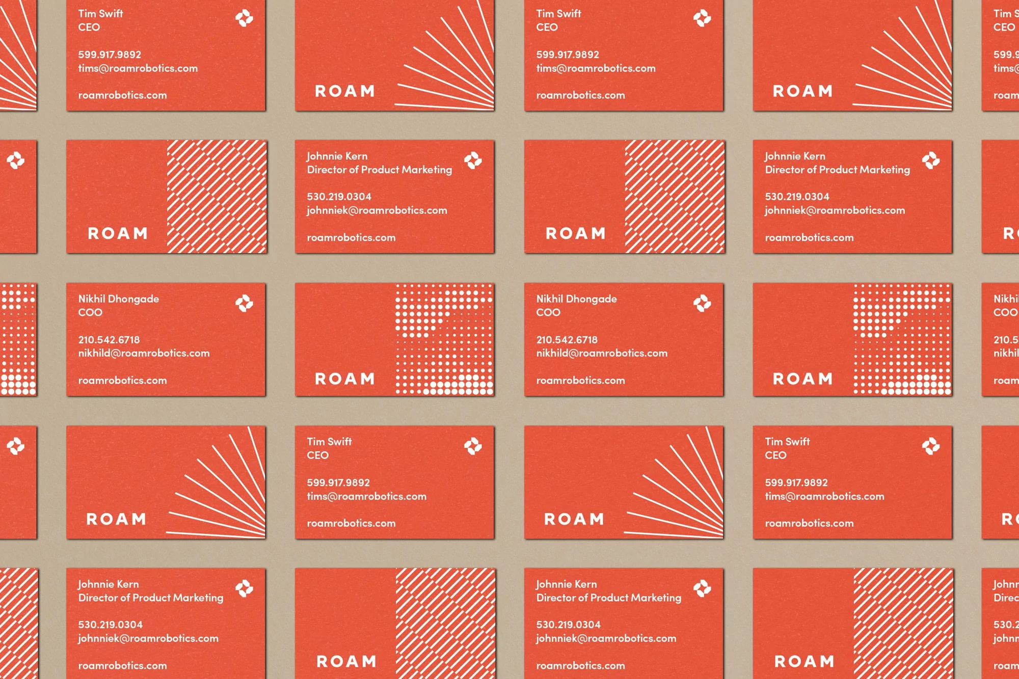
Havfram Brand Identity 2021
Associated creatives


Tags
Description
This image showcases a clean, grid-arranged flat lay of red business cards created as part of the brand identity project for Havfram. Each card features textured red paper stock paired with crisp white typography and diverse geometric accent graphics, including dot matrices, parallel lines, and radiating rays. The arrangement highlights various professional titles, contact information, and branding elements across the multiple cards. The neutral background complements the rich orange-red tones of the stationery, emphasizing the tactile quality of the print finish and the cohesive design system.
Style
Horizontal, Commercial, Clean, Geometric
Techniques
Typography
Color
Burnt Orange (70%)
Pure White (30%)
Background
Solid Colour
Context
Advertising Campaign