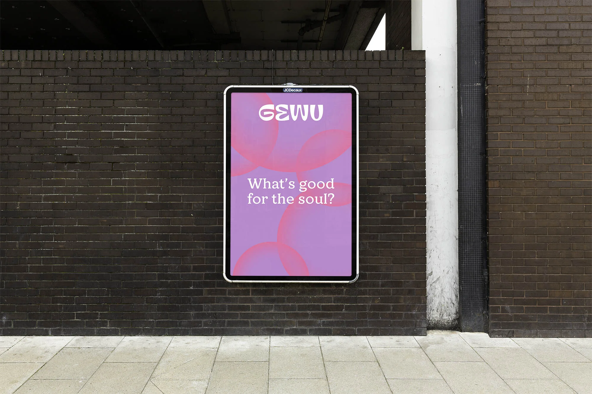
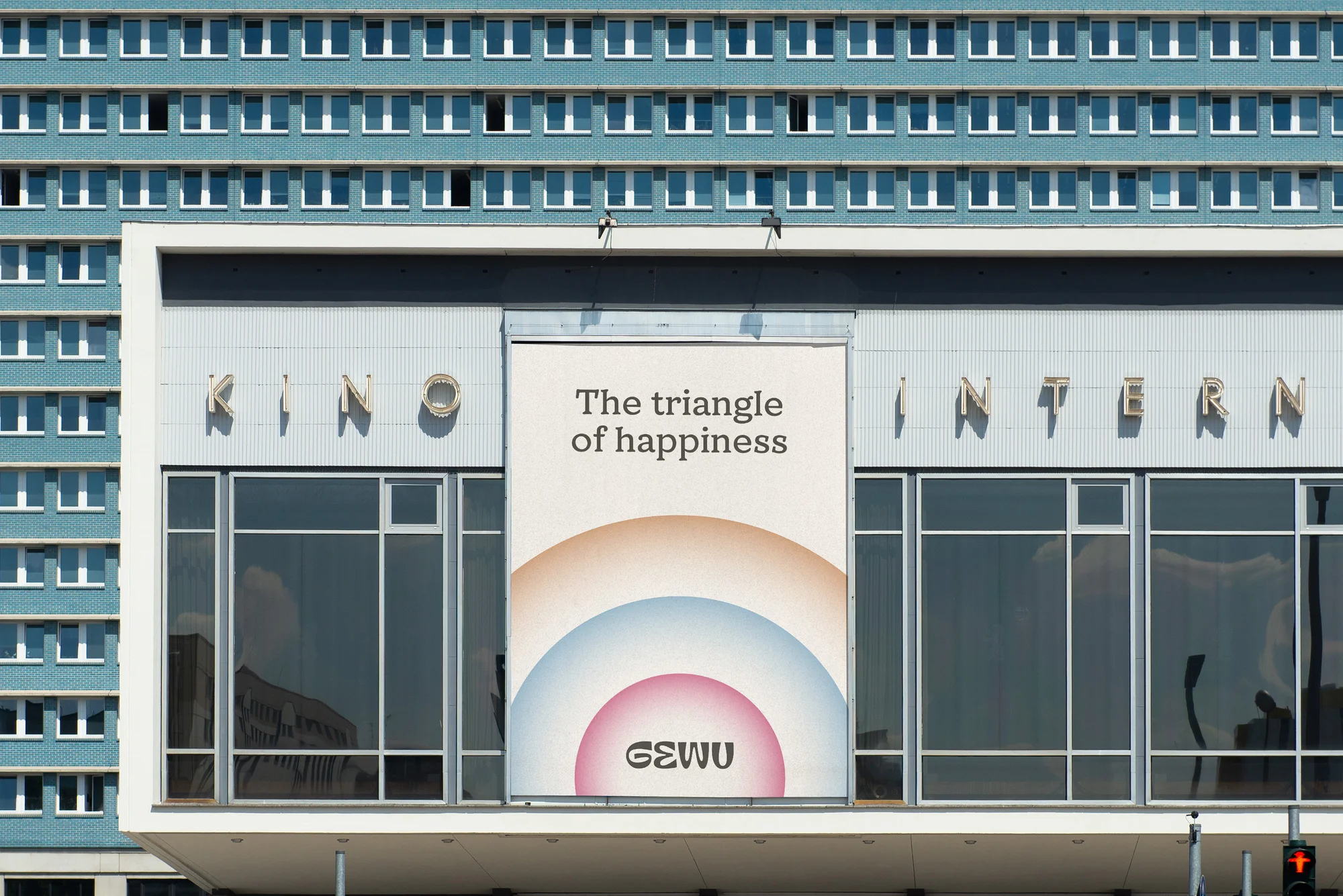
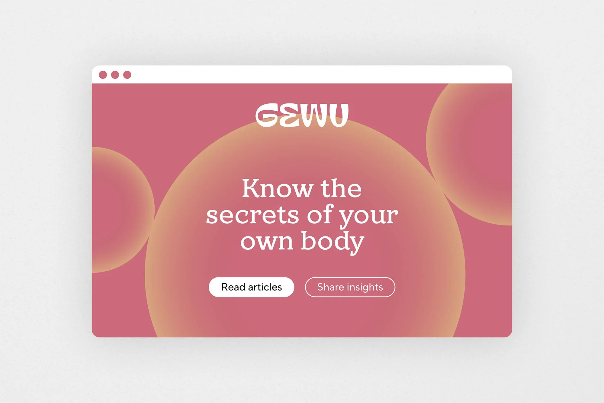
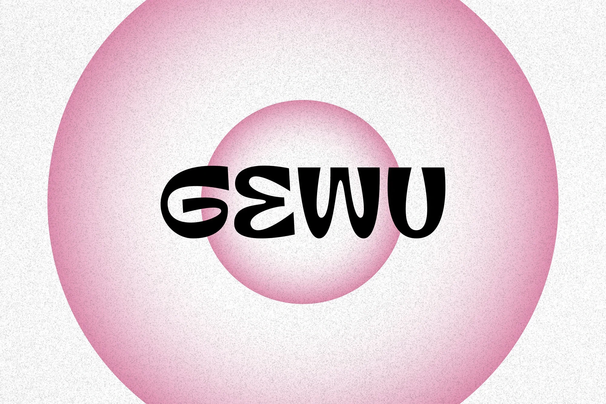
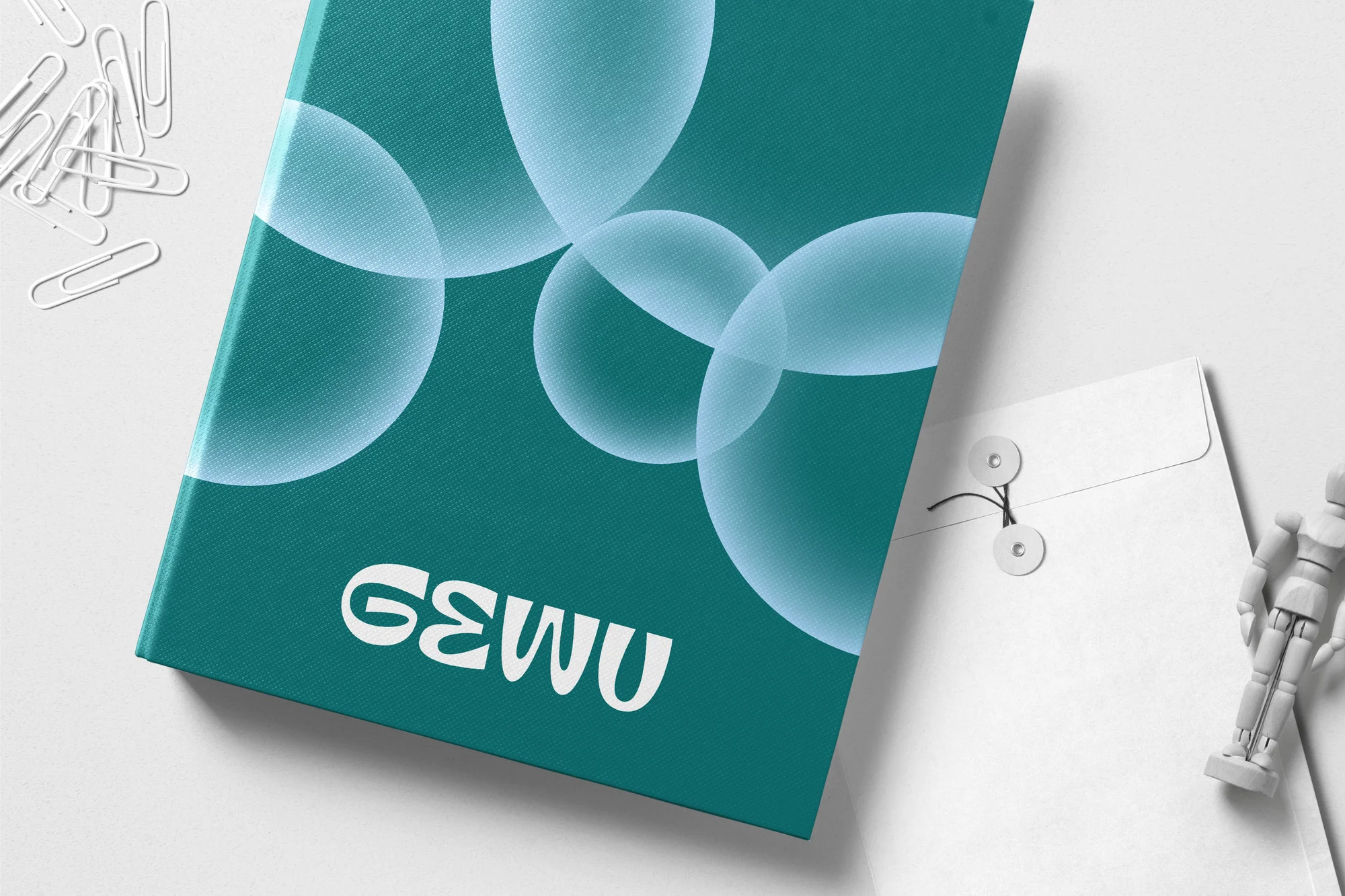
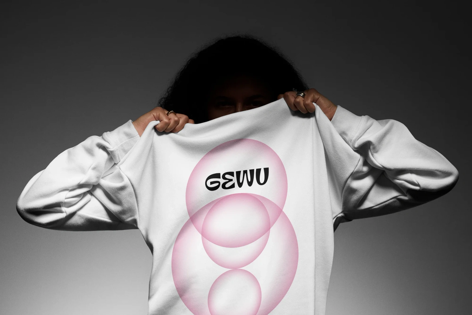
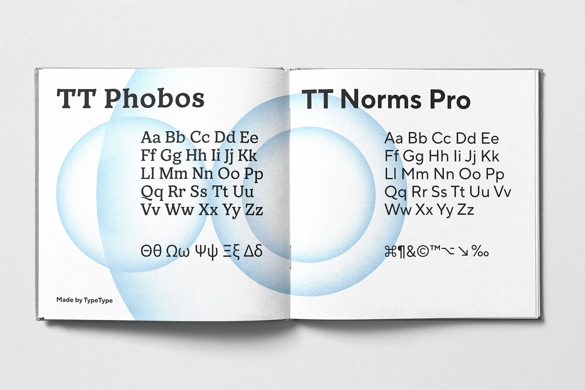
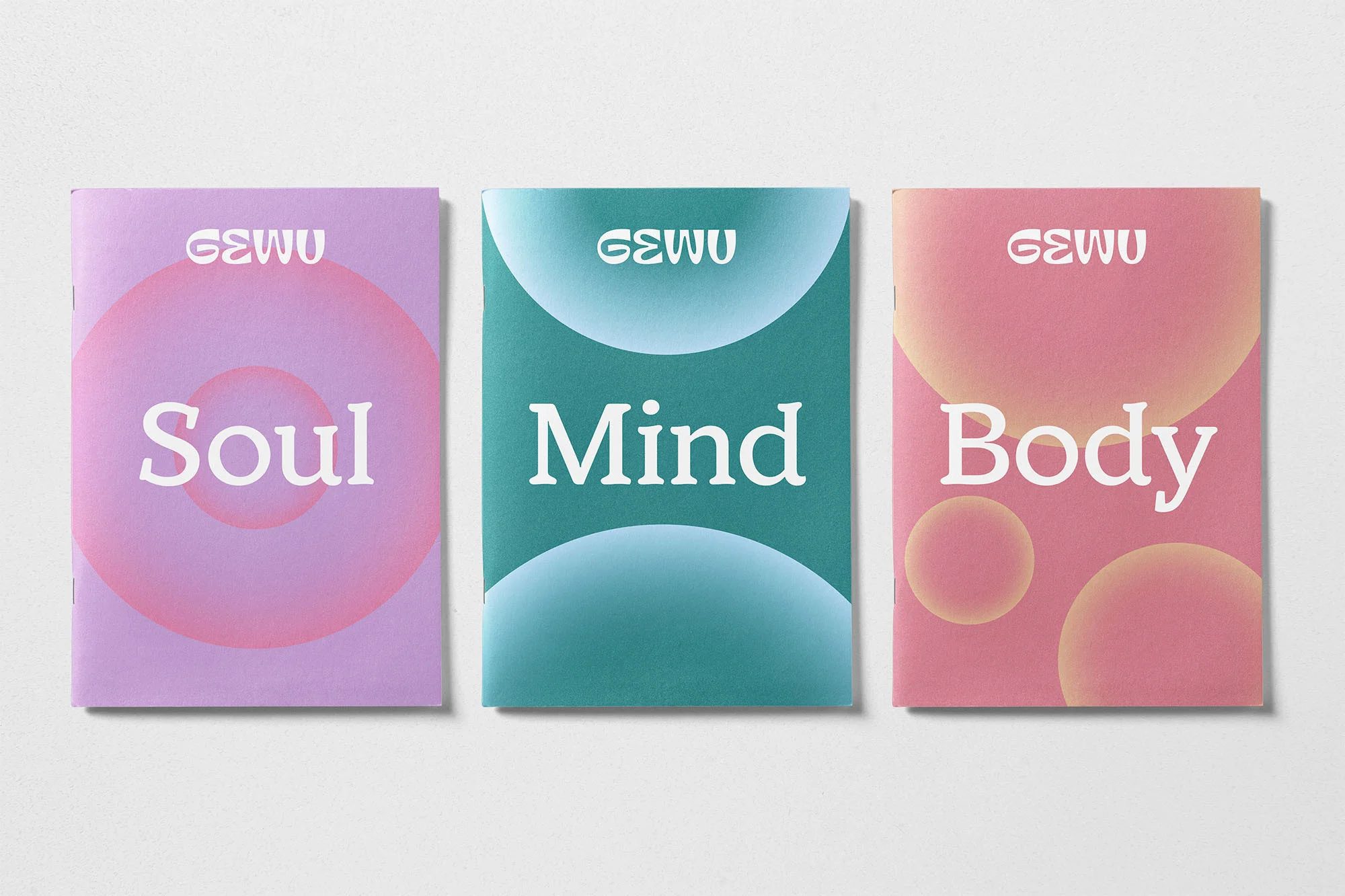
This brand identity project for Gewu establishes a visual language centered on minimalist typography and layered circular graphic elements. The work integrates a soft, warm color palette featuring gradients in purple, pink, and teal to create a cohesive aesthetic across digital and physical touchpoints.
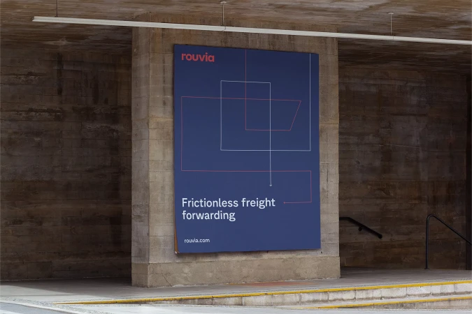
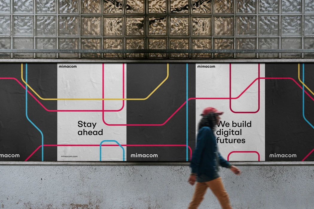
The system is applied across diverse media, including outdoor advertising displays, web interface design, and editorial print materials. With graphic design by Mirage, the project utilizes a clean, contemporary approach that prioritizes negative space and tactile print textures to define the brand's character.