
Mimacom: Brand Identity
Brand
Date
May 2023
Description
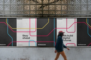
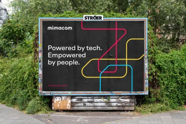
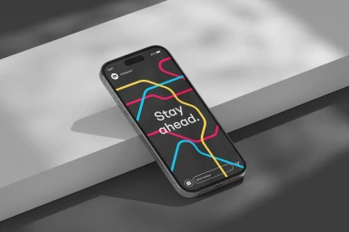
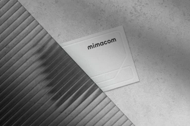
Mimacom introduces a refreshed brand identity across its digital and out-of-home platforms. The visual system centres on a minimalist aesthetic, utilizing a bold palette of magenta, yellow, and cyan lines that evoke a transit-map complexity against dark grey and white architectural backdrops. The project incorporates clean typography and structural graphic elements, with technical execution spanning digital interface design, billboard layouts, and tactile brand assets. Graphic design for the project was led by Mirage.
Style
Horizontal, Commercial, Minimalist, Clean
Techniques
Typography
Industries
Color
Pure White
Associated creatives

5000+ creatives to discover
Sign up to gain access to the entire directory. It’s free.
Visie is a curated library of creative professionals.