
Rouvia: Brand Identity
Nov 2022
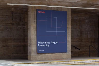
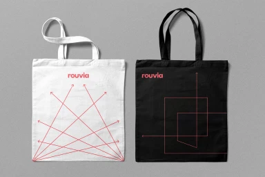
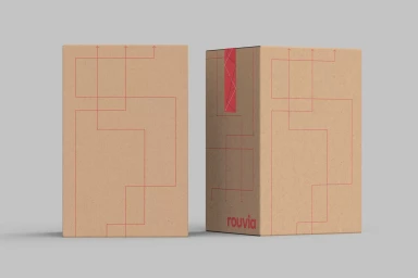
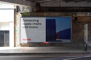
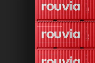
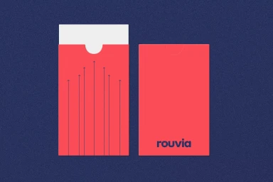
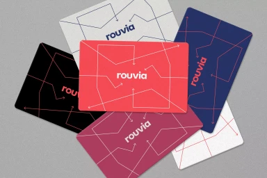
Rouvia’s brand identity system establishes a visual language centered on the concepts of logistics and connectivity. The project leverages a minimalist graphic design approach, utilizing a palette of saturated reds, deep blues, and industrial neutrals to anchor the brand across various touchpoints. The identity relies on precision-based geometric line art and recurring arrow motifs to represent the flow of supply chain operations. Developed by Mirage, the project expands the brand presence from digital and 3D renders to physical, commercial applications. The design system extends across diverse media, including tactile paper stocks, textile accessories, and large-scale outdoor signage. The typography remains consistent throughout the collateral, reinforcing a clean, structured aesthetic for the freight forwarding sector.
Horizontal, Commercial, Clean
