
Flight Club: Brand Identity


Jan 2019
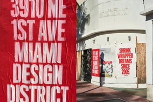
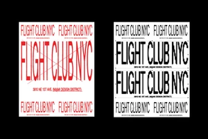
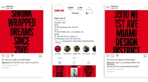
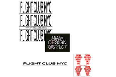
Flight Club’s latest brand identity project serves as a masterclass in modern commercial design, seamlessly bridging the gap between digital retail presence and tactile, urban street aesthetics. Spearheaded by the creative minds at Public-Library, the project leans into a bold, high-contrast palette of red, black, and white to establish a visceral brand narrative that resonates with the retailer's sneaker culture heritage. By utilizing rhythmic typographic grids and clean sans-serif layouts, the identity feels both structural and rebellious. The campaign execution is particularly striking, as the visual assets move beyond static UI illustration to occupy physical spaces. Throughout the Miami Design District, the brand utilizes weathered paper posters and bold, minimalist typography to transform urban architecture into a canvas. This approach makes expert use of natural light and hard light to create sharp, dramatic shadows against building facades, grounding the graphic designs in a real-world, cinematic environment. The integration of glitch-inspired treatments and raw, lo-fi textures provides an authentic edge that feels deeply connected to the street-level grit of the industry. This multifaceted design language successfully synthesizes a cohesive brand positioning, proving that even as Flight Club expands its physical footprint, it retains the evocative, dream-like quality captured by its signature slogan, Shrink Wrapped Dreams Since 2005. The result is a crisp, modern aesthetic that feels as vital in a digital social media feed as it does on a sun-drenched city wall.
Horizontal, Commercial, Clean
Typography
Advertising Campaign
