
BESE
Brand Identity
Apr 2018
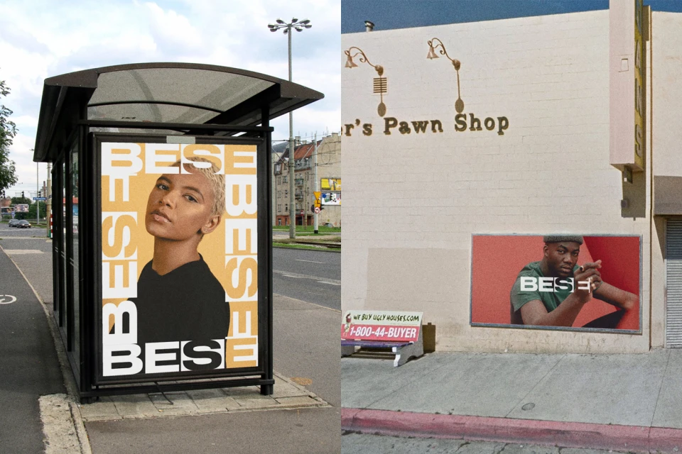
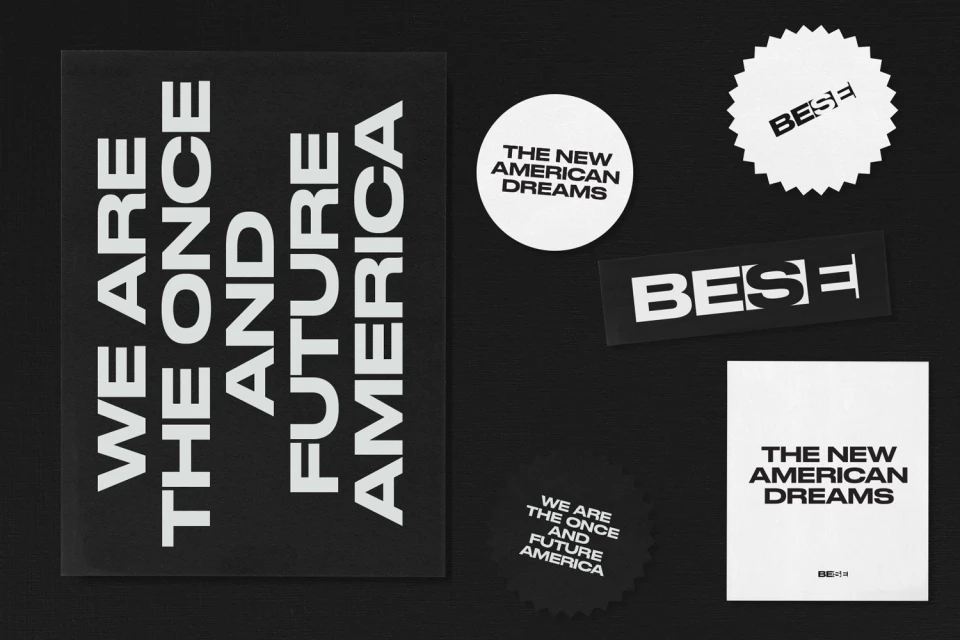
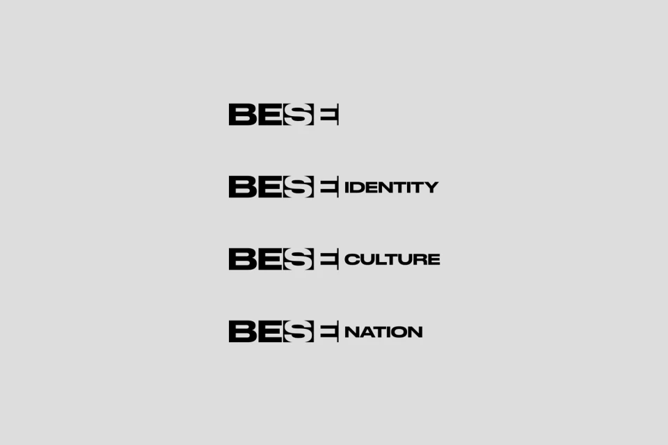
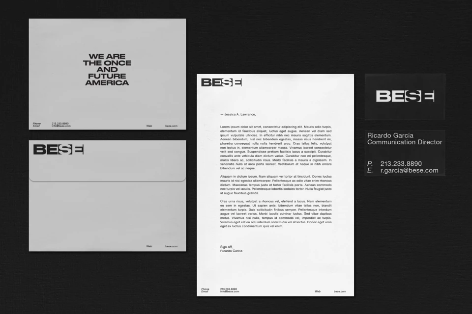
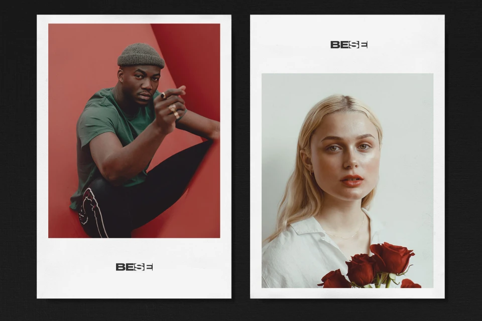
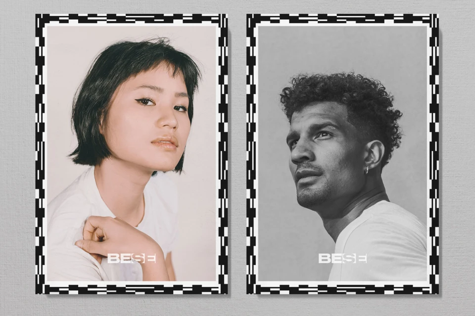
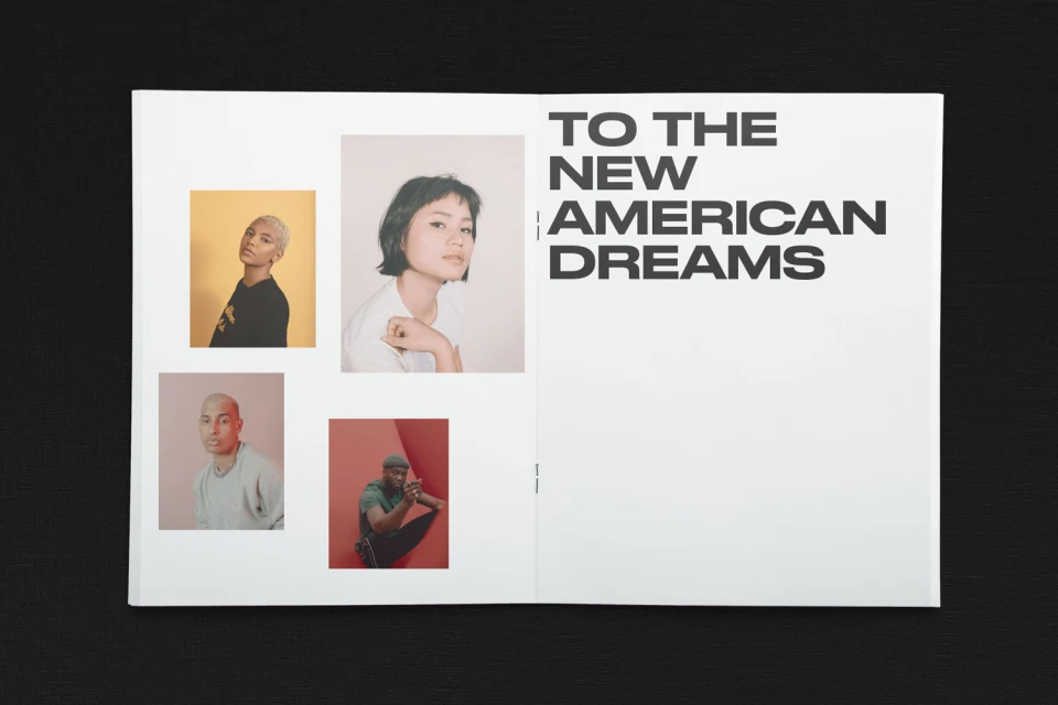
The BESE brand identity project, spearheaded by Public-Library, serves as a masterclass in modern corporate communication and editorial design. By utilizing a high-contrast monochrome palette paired with bold, sans-serif typography, the studio has crafted a visual system that feels both authoritative and approachable. The project leans into a minimalist aesthetic, anchored by the consistent application of the BESE wordmark across various collateral, from professional letterheads and business cards to large-scale outdoor advertising. Through a series of carefully curated editorial portraits, the brand captures a diverse range of faces and expressions, effectively grounding its mission—We Are The Once And Future America—in human connection. The integration of live-action techniques and studio strobe lighting creates a polished, high-end finish that elevates standard promotional materials into a cohesive cultural narrative. Whether viewed as an open magazine spread or a die-cut sticker, the design language remains uniform and intentional. The work expertly balances a corporate sense of order with an editorial edge, utilizing vector-based precision and clean layouts to maintain impact. Ultimately, this comprehensive identity system demonstrates how intentional graphic design can define the character of a nation, utilizing a sharp, modern visual guide that feels both timeless and urgent in the current media landscape.
Horizontal, Commercial, Clean, Minimalist
Typography
