
Bishops
Brand Identity
Jan 2018
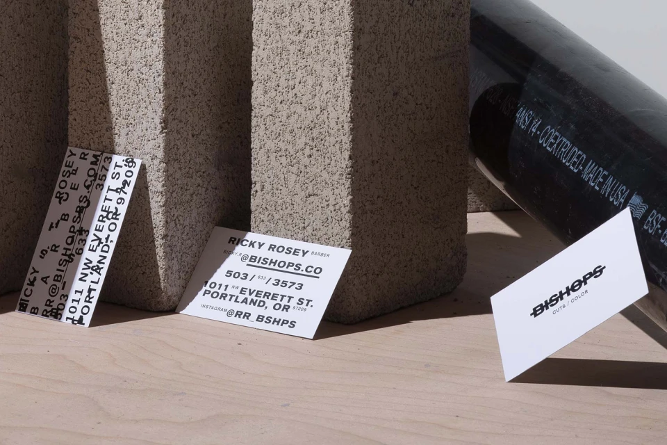
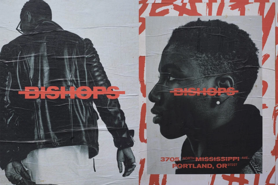
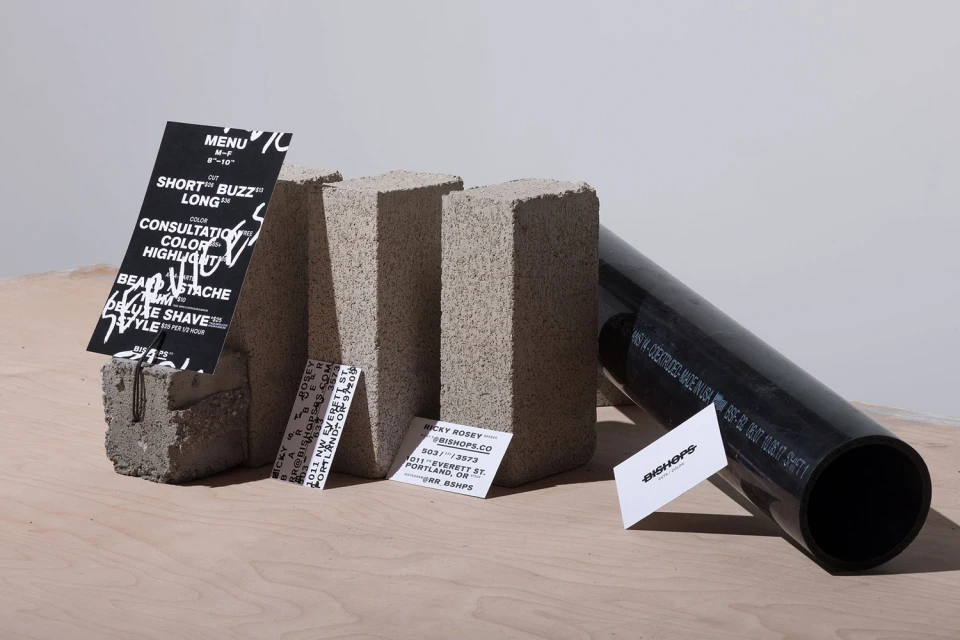
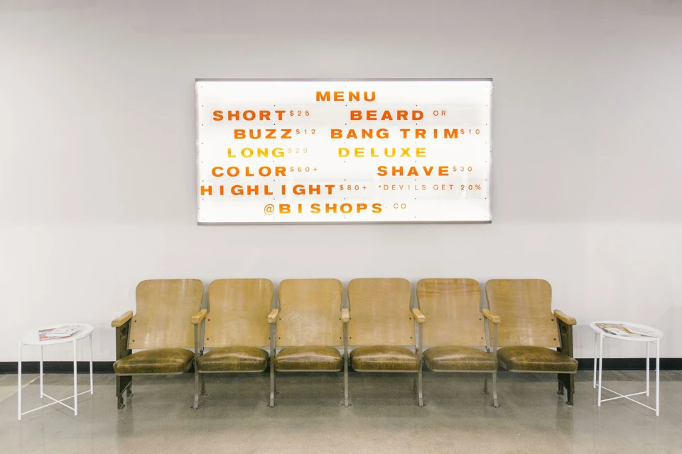
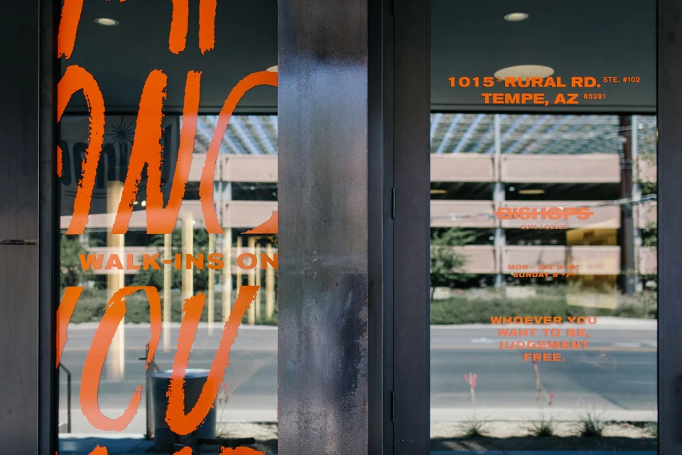
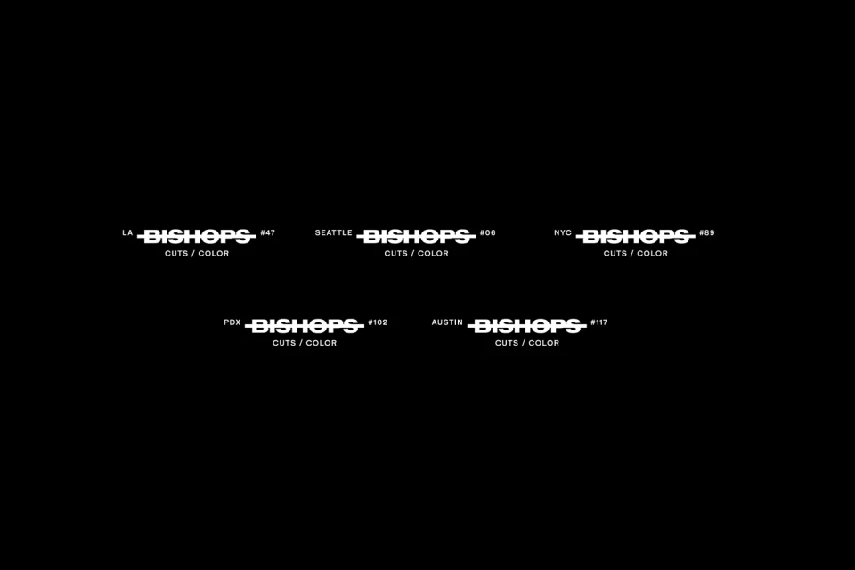
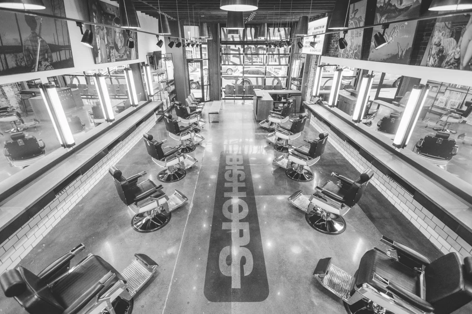
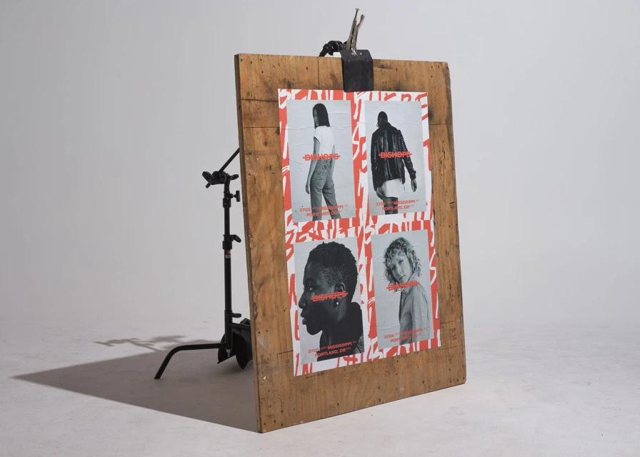
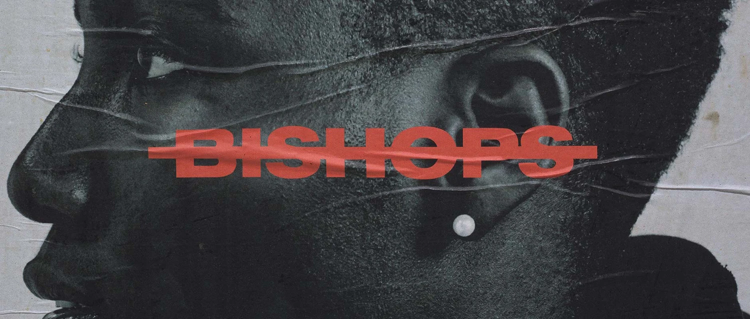
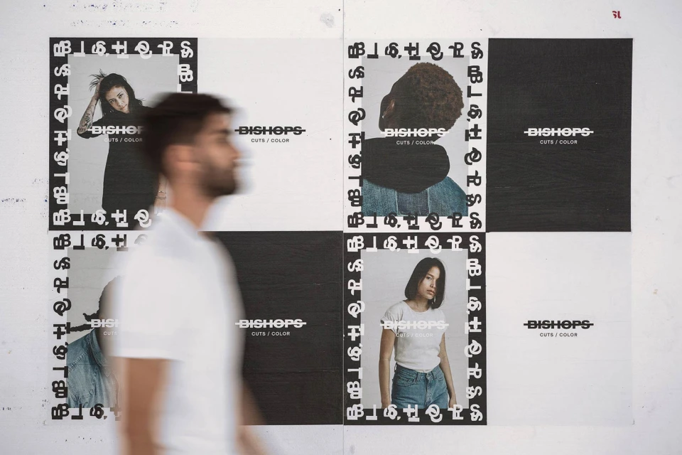
The brand identity for Bishops reimagines the traditional barbershop experience through a lens of urban grit and high-end graphic sophistication. Orchestrated by Public-Library, the project leans into a raw, industrial aesthetic that bridges the gap between commercial service and cultural editorial. The design language utilizes a stark, high-contrast palette of black, white, and urgent flashes of red, creating a visual system that feels both modular and tactile. By integrating screen print and silkscreen techniques onto textured paper, the collateral feels grounded and authentic, contrasting sharply with the minimalist, polished concrete interiors of the salon spaces. Typography serves as the backbone of the identity, employing bold sans-serif lettering that commands attention whether applied as signage on storefront glass or layered over black-and-white portraiture in campaign posters. The spatial design, defined by symmetrical layouts and deliberate, high-key lighting, reinforces a sense of orderly modernism. Through the clever use of collage and natural light photography, the identity succeeds in transforming utilitarian barbershop services into a cohesive lifestyle brand. The resulting look is cinematic and intentional, favoring clean lines and aggressive graphic strikes that capture the rebellious spirit of the brand. Ultimately, this work channels a sense of deliberate urbanity, positioning Bishops as a space where high-functioning design meets an inclusive, judgment-free environment for creative expression.
Horizontal, Commercial, Clean
Typography
Advertising Campaign
