
Eli Altman: Brand Identity





Jun 2019
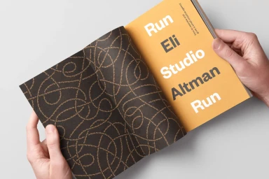
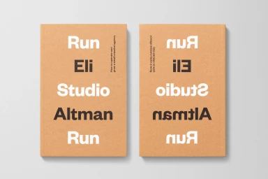
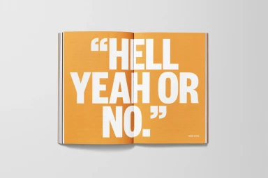
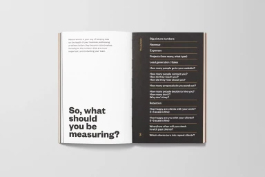
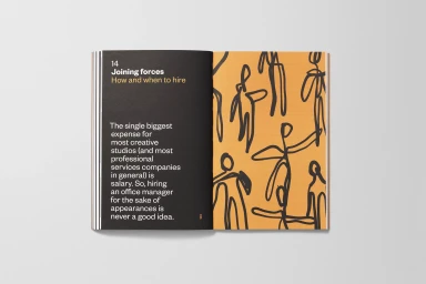
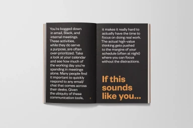
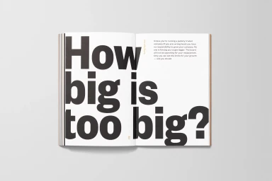
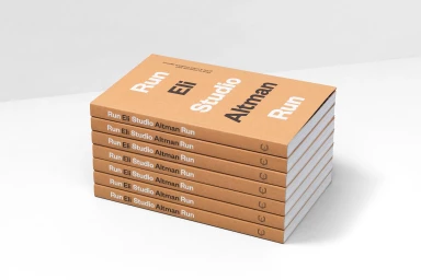
The brand identity for Eli Altman reflects a masterclass in editorial minimalism and structured graphic design, positioning the creative agency through a lens of tactile, professional clarity. Developed with refined graphic design by Moniker, the project utilizes a deliberate and highly disciplined visual language that eschews ornamentation in favor of direct communication. The aesthetic leans into a sophisticated color palette of matte cardboard browns, vibrant mustards, and sharp high-contrast black-and-white compositions, emphasizing the physical presence of the brand across a series of printed books and collateral. By integrating techniques such as typography-driven layouts, vector-based infographic detailing, and the clever use of industrial materials like adhesive tape, the identity reads as both a practical manual and an artistic statement on the mechanics of agency growth. The execution highlights a rhythmic, repetitive use of sans-serif typography that transforms business operations—from hiring strategies to financial metrics—into a cohesive design system. Through high-key studio lighting and minimalist editorial spreads, the work achieves a striking balance between corporate functionality and modern design rigor. This project demonstrates how a cohesive, typography-focused approach can elevate standard brand guidelines into a compelling, tactile experience that feels as much like an art object as it does a business tool, perfectly capturing the essence of a modern, efficient studio.
Horizontal, Commercial, Clean, Minimalist
Typography
