
Occulus: Brand Identity

Jul 2021
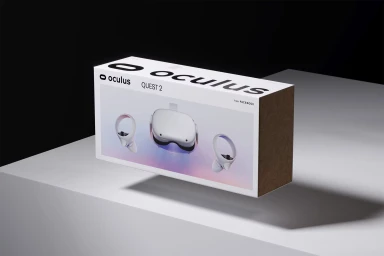
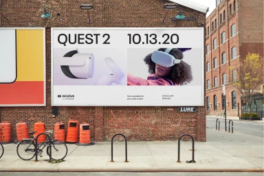
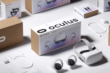
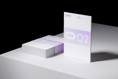
The Occulus brand identity project establishes a comprehensive visual language for the Quest 2 hardware ecosystem. The campaign utilizes clean graphic design and high-contrast typography to define the product's presence across diverse touchpoints, including large-scale outdoor billboards and retail packaging. Execution across both print and motion media focuses on a minimalist aesthetic, often leveraging 3D render / CGI techniques to isolate hardware components. Graphic design studio Moniker provided the core typographic systems and motion graphics, maintaining a consistent brand architecture that spans from architectural environmental signage to detailed product documentation and digital animations.
Horizontal, Commercial, Clean, Minimalist
White Seamless
