
Mita Chocolate Co.
Brand Identity
Jan 2016
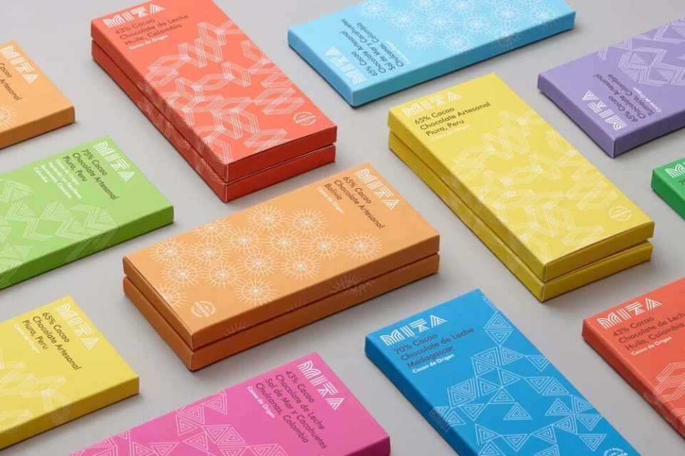
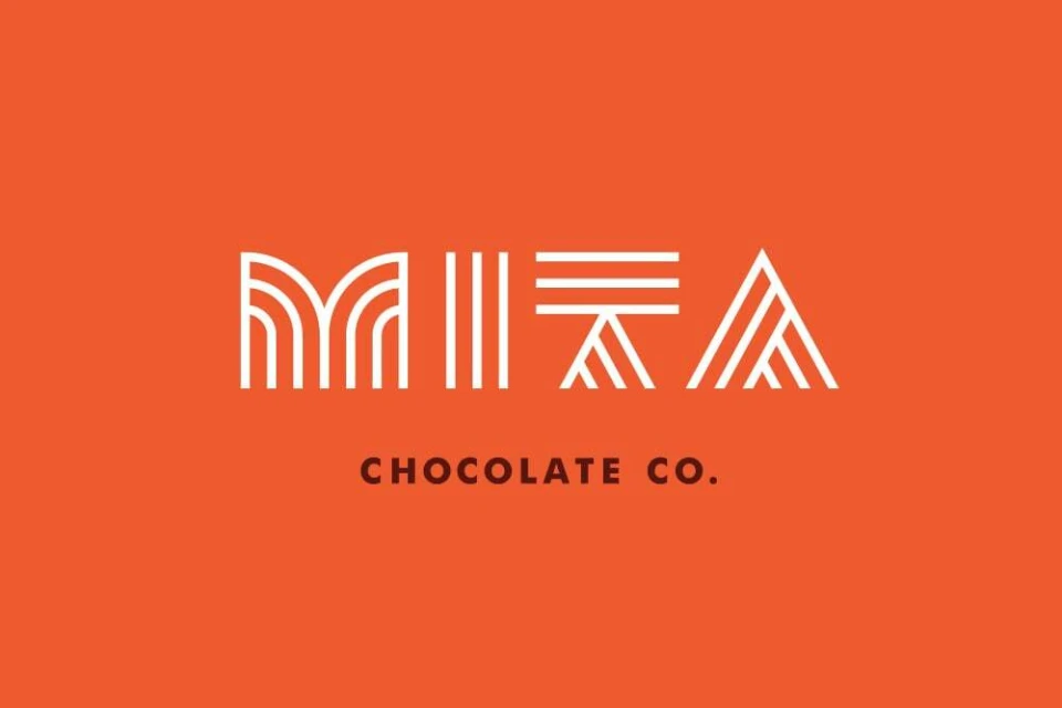
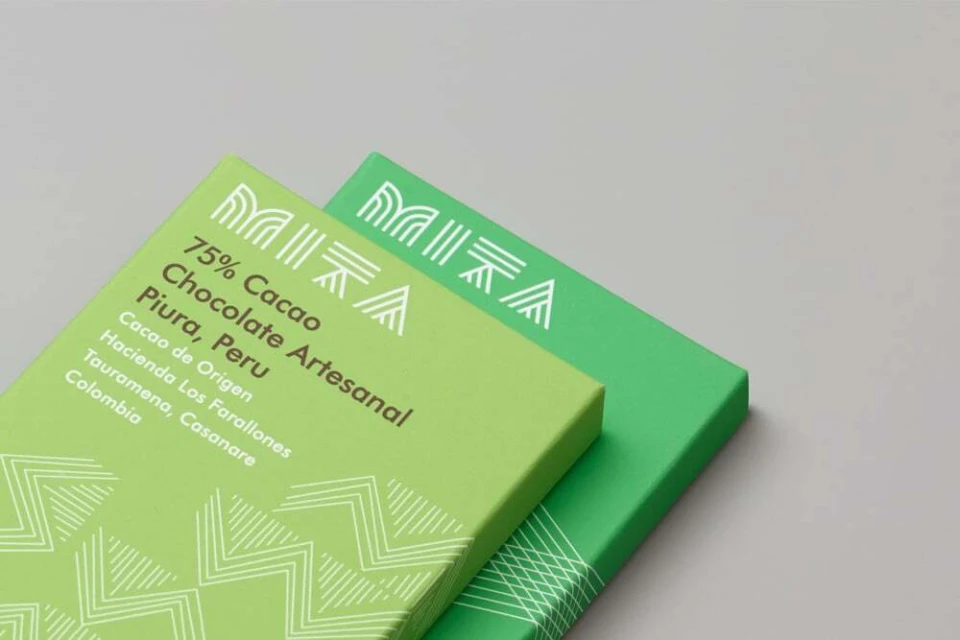
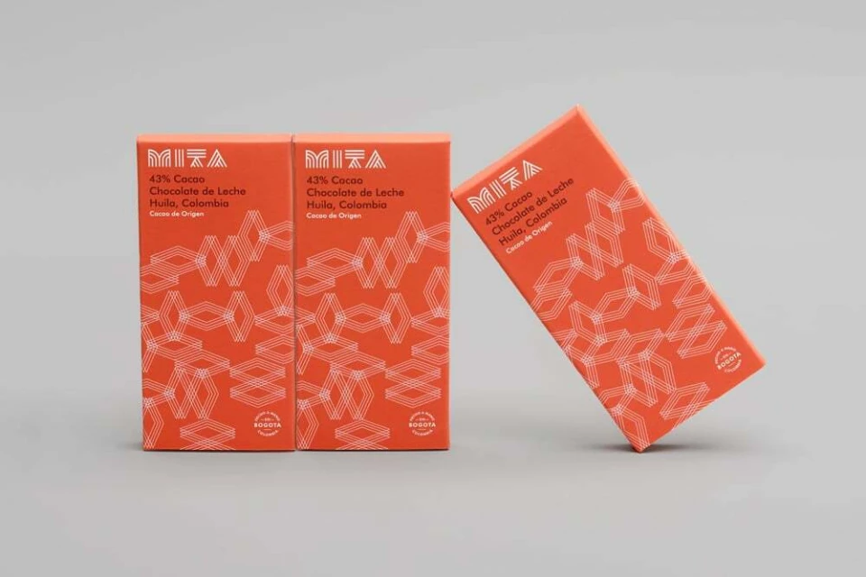
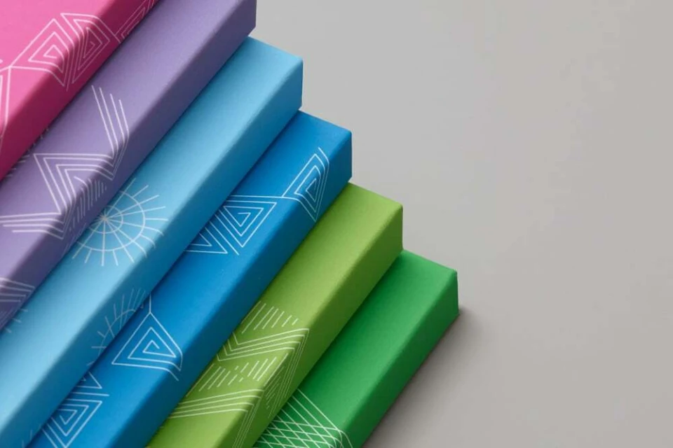
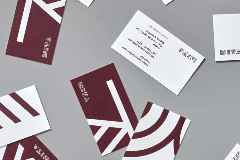
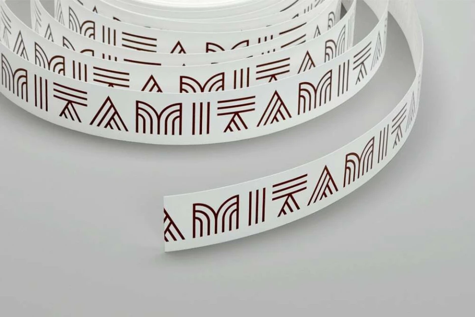
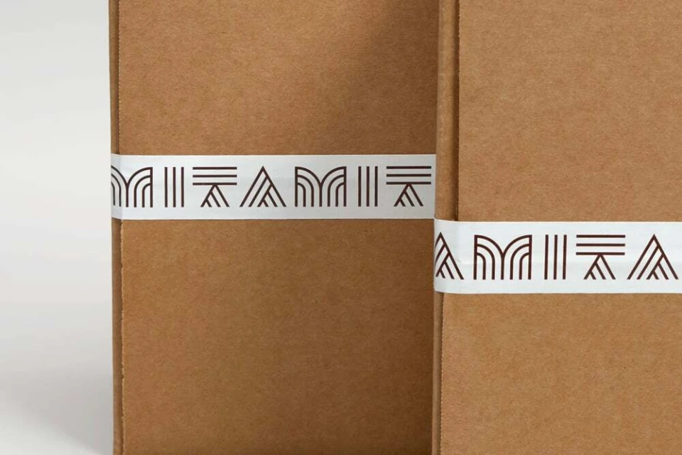
The brand identity for Mita Chocolate Co. represents a masterclass in modern, minimalist CPG packaging design, where vibrant color theory meets precise, geometric craftsmanship. Developed by the design team at Moniker, the visual system leans into an editorial sensibility, favoring a clean, grid-like modularity that allows the product to stand out against a neutral, matte grey studio backdrop. The identity is defined by a bold, saturated palette—spanning lime green, magenta, and sunshine yellow—that provides a high-contrast foundation for the intricate, white line-art patterns that define the brand's aesthetic. Through the application of Commercial studio strobe lighting, the packaging is rendered with sharp, professional clarity, emphasizing the tactile quality of the materials and the mathematical rigor of the typography. The project successfully balances a playful, energetic use of color with the restrained elegance of a corporate identity, utilizing vector design principles to create a consistent, scalable system across diverse touchpoints, including bespoke adhesive ribbons, minimalist business cards, and modular box packaging. By isolating the product against soft-focus backgrounds and utilizing symmetrical compositions, the work reinforces Mita Chocolate Co.’s position as a premium player in the food and beverage industry. This design strategy serves as a blueprint for how thoughtful, pattern-driven graphic design can elevate a simple retail object into a cohesive, sophisticated brand experience that feels both accessible and distinctly elevated.
Horizontal, Commercial, Clean, Minimalist
Typography
CPG / Packaged Food
Grey Seamless
E-commerce / Product
