
Maryanne Mooney: Brand Identity




Mar 2019
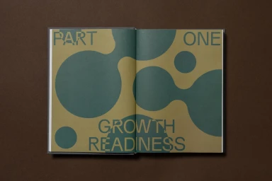
The brand identity for Maryanne Mooney, executed by The Colour Club, stands as a masterclass in editorial minimalism and high-end corporate collateral. Moving beyond standard communication tools, the project crafts a tactile narrative through the deliberate use of premium materials and structural precision. Each spread, captured through a series of focused, high-angle compositions, channels a sense of methodical growth and professional clarity. The design relies heavily on typography as a primary visual driver, utilizing clean, sans-serif layouts that balance negative space with bold, geometric interventions. Techniques such as emboss & deboss add a layer of sensory sophistication to the charcoal gray, linen-bound volumes, effectively transforming corporate documentation into an object of permanent value. The project leans into a vibrant yet controlled color palette, where muted sage, indigo, and terracotta act as anchors for the crisp, informative content. By integrating UI illustration elements with structured grid systems, the design effectively translates complex leadership philosophy into an accessible, visually rhythmic experience. Throughout the collection, the use of square formatting and balanced negative space ensures a cohesive aesthetic that feels both modern and timeless. Ultimately, this identity system demonstrates how thoughtful graphic design can elevate professional branding, turning internal organizational literature into a polished, sophisticated statement of intent that resonates with clarity and purpose.
Horizontal, Commercial, Clean
Typography
