
Brand
ProjectBrand Identity
Durasein Brand Identity 2020
Associated creatives


Tags
Description
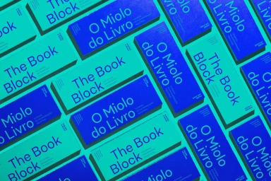
An overhead flat lay photograph displays a uniform grid of rectangular book spines arranged in an alternating pattern of deep blue and bright turquoise. Each spine features crisp typographic lettering including titles such as The Block and O Miolo do Livro. The clean geometric arrangement creates a vibrant, high-contrast visual rhythm across the frame. The lighting is even and diffused, highlighting the bold colour palette and smooth matte finish of the covers. This piece forms part of the brand identity project for Durasein.