
Design District: Brand Identity


May 2022
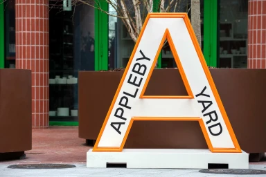
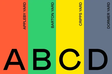
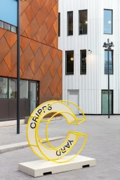
Design District introduces a cohesive brand identity developed by DutchScot, focusing on functional wayfinding and environmental graphics. The project integrates clean, minimalist typography and a distinct color palette of orange, green, yellow, and grey to define various zones across the urban landscape. By utilising three-dimensional sculptural lettering and geometric signage, the system creates clear visual markers against the site's industrial and modern architectural backdrop. The identity employs vector-based graphic elements and bold sans-serif type to navigate visitors through different yards, including Appleby and Cripps Yard. The implementation relies on natural light to highlight the contrast between structured signage and the surrounding concrete, masonry, and metal surfaces, maintaining a consistent aesthetic throughout the public square and exterior spaces.
Horizontal, Commercial, Clean
Natural light
Advertising Campaign
