
Club Brugge
Brand Identity
Jan 2021
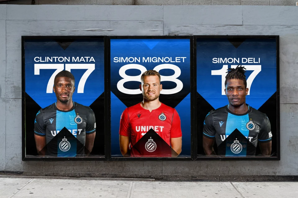
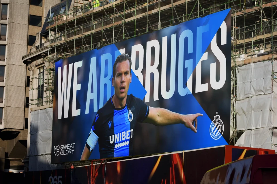
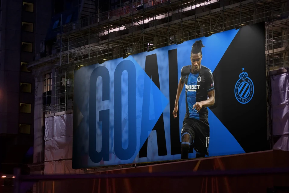
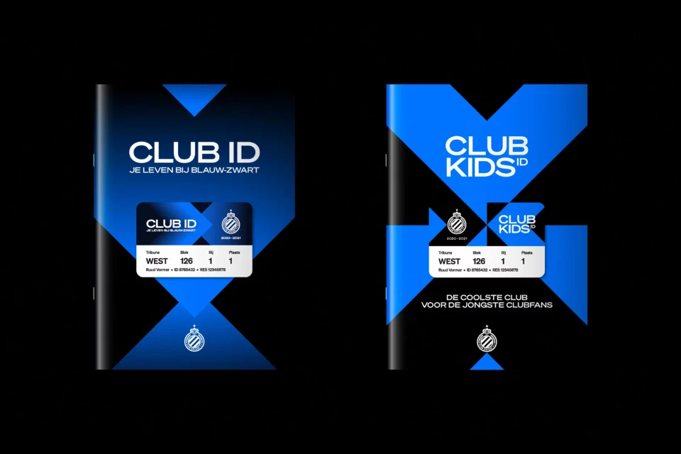
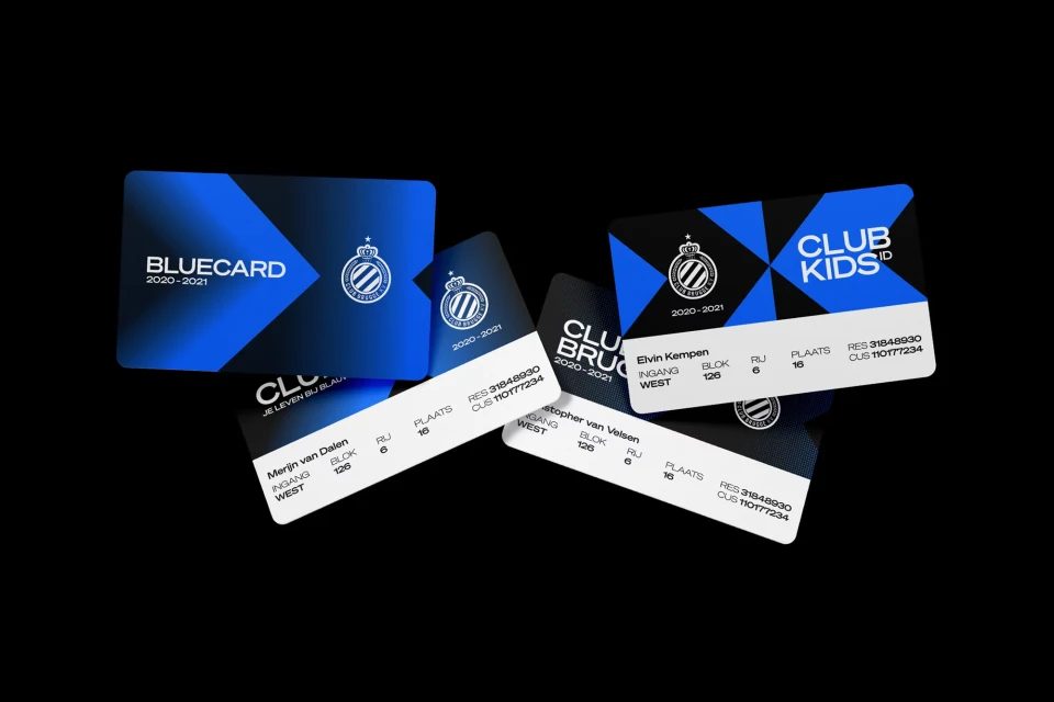
Club Brugge partnered with Studio Dumbar to develop a comprehensive brand identity that centers on a high-contrast aesthetic. The system utilizes a saturated palette of blue and black, anchored by sharp geometric elements and bold typography to create a cohesive look across digital and physical touchpoints. The project encompasses a wide range of applications, from large-format outdoor billboards and athletic portraiture to specialized membership identification cards. Motion graphics play a significant role in the identity, with kinetic typography and dynamic animations used to energize matchday announcements, scoreboards, and promotional content. By integrating minimalist graphic layouts with athletic imagery, the design system aims to modernise the club's visual presence. The work leans into a clean, vector-based design language that remains consistent whether applied to environmental signage or fast-paced screen media.
Horizontal, Commercial, Clean
Soccer
