
Cumulus Park: Brand Identity
Mar 2020
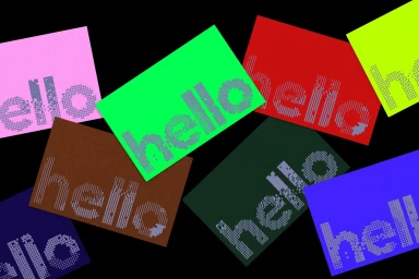
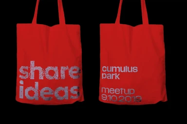
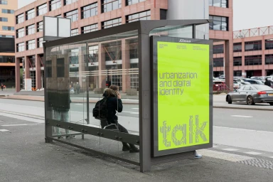
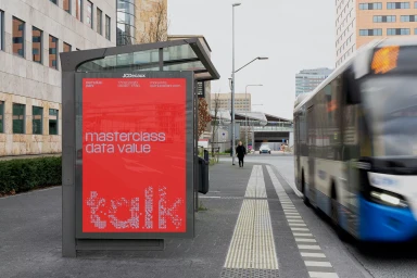
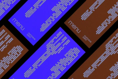
The brand identity project for Cumulus Park, masterfully executed by the design experts at Studio Dumbar, serves as a masterclass in how to bridge the gap between digital-first aesthetics and physical urban infrastructure. The creative direction leans into a bold, high-contrast visual language that bridges the gap between the virtual and the material world. By utilizing a distinct fragmented, pixelated typography, the identity captures the essence of a digital-forward community while maintaining a cohesive look through vibrant, solid color fields and recurring geometric patterns. The implementation is impressively multifaceted, transitioning from abstract UI illustration elements and detailed vector menu cards to high-visibility, commercial out-of-home advertising. The integration of these elements into the physical streetscape—observed in the bright lime green and vivid red bus shelter placements—proves the effectiveness of a versatile, high-contrast design system. Throughout the campaign, the work employs a blend of live-action technique and clean, sans-serif layouts to communicate complex topics like data value and urbanization with refreshing clarity. The result is a dynamic brand ecosystem that feels both grounded in a specific, modern location and infinitely scalable, with the deliberate use of dot-matrix styles and metallic silver finishes lending a sophisticated, contemporary edge to every touchpoint. This project effectively proves that a strong, consistent identity remains the most powerful tool for shaping the perception of modern collaborative spaces.
Horizontal, Commercial
Black Seamless
